Philip Swan: No Innocent Eye

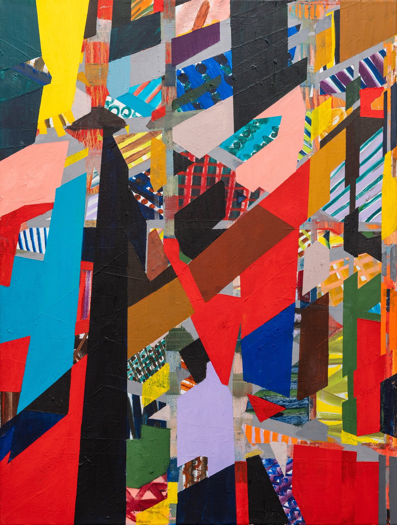
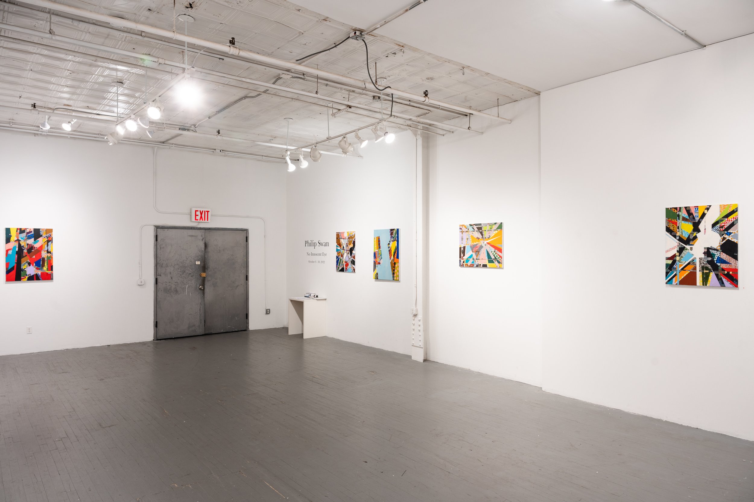
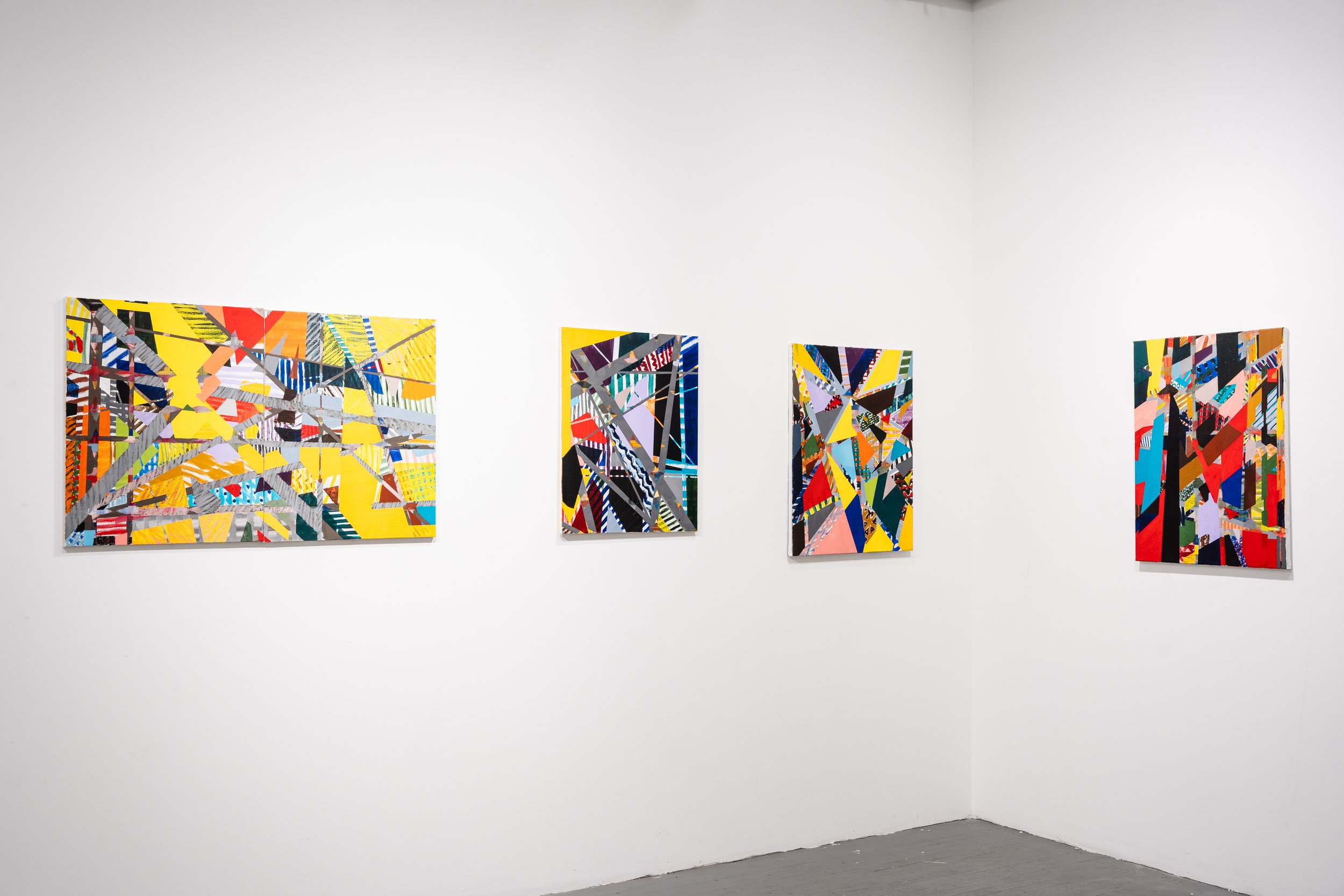
Amos Eno Gallery is pleased to present No Innocent Eye, a solo exhibition of new works by artist Philip Swan. The exhibit will run at Amos Eno Gallery from October 6 – October 30, 2022, with an opening reception on Friday, October 7, 2022. 

In addition to the in-person opening reception, on Friday, October 28, from 7-9 PM, there will be a performance by Matt Mottel and a panel discussion with Phil Swan and Matt Mottel, moderated by Amos Eno Gallery Director Emireth Herrera.

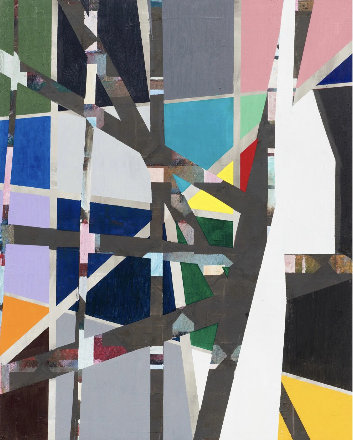
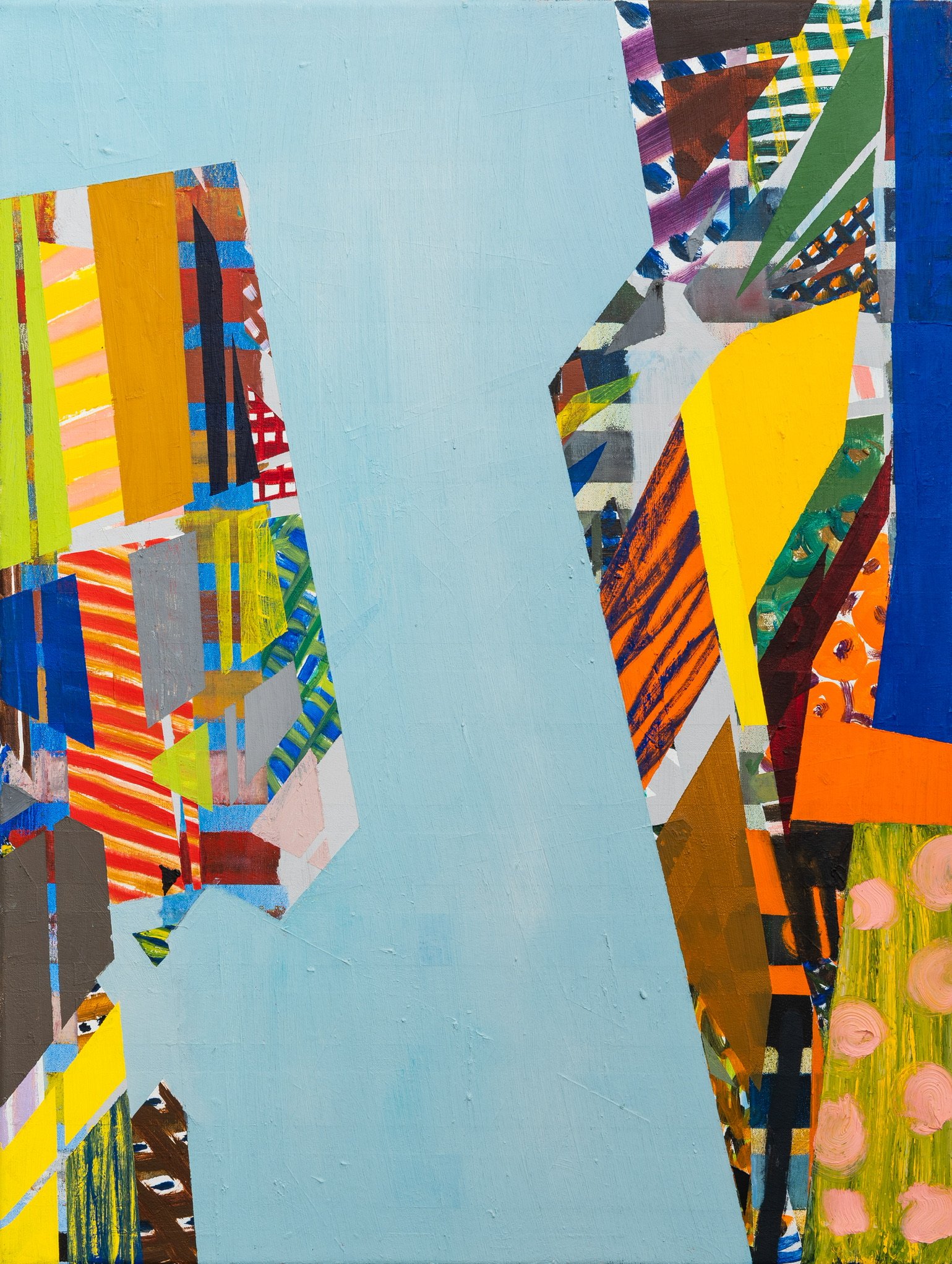
The phrase “No Innocent Eye” was coined by art historian E.H. Gombrich in his book Art and Illusion: “There is no reality without interpretation: just as there is no innocent eye, there is no innocent ear.” Gombrich argued that, like someone listening to music, a viewer of art cannot look at a work without trying to classify what they are seeing in the context of what they have previously seen on gallery walls or in their day to day life. Even when looking at an abstract work of art, there is no way to disengage the mind’s need for patterns of association even when an artwork does not represent anything recognizable that can be easily categorized and understood. More recently, neuroscientists like Eric R. Kandel and Anil Seth have used Gombrich’s insights to discuss the way our brains take visual information from our eyes and use Gestalt rules of organization and top-down processing to construct an internal representation of the outside world, or what Gombrich called the “beholder’s share.” Inspired by these ideas, Swan is exploring the way viewers unconsciously interpret abstraction through free association, engaging with shapes, colors, lines and textures in ways that draw on memories and emotions inspired by, but in no way determined by, the memories and emotions of the artist who created the work. By encouraging an element of introspective daydreaming, or what psychologists term “preconscious mental processes,” Swan wants to share the sense of transcendence he has in creating his paintings, a process he feels is analogous to instrumental music, with those taking advantage of the ambiguity of the works to generate emotional associations colored by their own personal experiences. This show consists of thirteen oil paintings on canvas. The paintings are self-contained, but connected through color and compositional similarity. In the process of creating work, Swan conceives of compositional and aesthetic roadblocks and then improvises his way to a solution while avoiding resolving problems concretely, thus allowing previous stray pathways which eluded resolution to remain visible. The resulting pentimento gives the work its complex composition. 

 Swan has explored geometric abstraction in various mediums over the past two decades. No Innocent Eye marks a new trajectory that combines formalist geometric abstraction with a more gestural mark-making than has been seen in previous work.

Philip Swan is a self-taught painter who has been showing at Amos Eno since 2018. He has a BA and MSI from the University of Michigan and an MA from the College of William and Mary. He is originally from Michigan and has lived in New York since 1997. His work has been featured in many group shows in Manhattan, Brooklyn, and New Jersey. Starting this fall his work will also be represented by Galle Gallery in Irvington New York.
Jasper Johns: Mind/Mirror

Introduction

PrintsJasper Johns, now 91, is known for artwork about everyday things like maps, targets, flags, light bulbs and beer cans, or, as Johns famously put it, “things the mind already knows.” Johns describes his approach to art as "Take an object. Do something to it. Do something else to it. (Repeat)." Of course, there is much more to this easy to remember formula. There is a distinct sense of poetry in the work of Jasper Johns as he addresses love, heartbreak, nostalgia, and mortality in a kind of internal archaeology where these everyday objects take on a totemic importance that come in recursive refrains. Often this recursive approach comes through mirror images of previous work along with a layering of older motifs alongside newer ones. In a sense, this mirrors the way the mind works as it returns to a categorical inventory, shorthand summaries of life embodied in objects we find personally cogent. What ties all of his work together is the importance of memory in a meaningful life, specifically visual memory. Johns wants us to look at the world more actively, to look at the familiar and to look at it again more carefully as a way of being truly alive. The prints in the first gallery are an excellent overview of this methodology and an unusual way to begin a retrospective like this. Rather than a large wall-spanning painting, the viewer takes in a series of small prints that serve as a preview of his entire career. It is also appropriate because printmaking is central to Johns, who does not see prints as being a lower order in the hierarchy of his work. They are a stunning testimony to his creativity and are so varied that they do not look like the work of one individual.  This show is very large, grab a seat if you need to. There is also a lot of talk about symbols and motifs but you can also just enjoy the work aesthetically: Johns is a master of design and texture, his work is beautiful and he actually would prefer that it be appreciated that way with the references unclear and their mystery part of the experience.

Prints

Jasper Johns, now 91, is known for artwork about everyday things like maps, targets, flags, light bulbs and beer cans, or, as Johns famously put it, “things the mind already knows.” Johns describes his approach to art as "Take an object. Do something to it. Do something else to it. (Repeat)." Of course, there is much more to this easy to remember formula. There is a distinct sense of poetry in the work of Jasper Johns as he addresses love, heartbreak, nostalgia, and mortality in a kind of internal archaeology where these everyday objects take on a totemic importance that come in recursive refrains. Often this recursive approach comes through mirror images of previous work along with a layering of older motifs alongside newer ones. In a sense, this mirrors the way the mind works as it returns to a categorical inventory, shorthand summaries of life embodied in objects we find personally cogent. What ties all of his work together is the importance of memory in a meaningful life, specifically visual memory. Johns wants us to look at the world more actively, to look at the familiar and to look at it again more carefully as a way of being truly alive. The prints in the first gallery are an excellent overview of this methodology and an unusual way to begin a retrospective like this. Rather than a large wall-spanning painting, the viewer takes in a series of small prints that serve as a preview of his entire career. It is also appropriate because printmaking is central to Johns, who does not see prints as being a lower order in the hierarchy of his work. They are a stunning testimony to his creativity and are so varied that they do not look like the work of one individual.

This show is very large, grab a seat if you need to. There is also a lot of talk about symbols and motifs but you can also just enjoy the work aesthetically: Johns is a master of design and texture, his work is beautiful and he actually would prefer that it be appreciated that way with the references unclear and their mystery part of the experience.

Disappearance and Negation

Target with Four Faces, 1955Jasper Johns moved to New York in the summer of 1953 after being discharged from the Army in South Carolina. In 1954 Johns destroyed all of his work as a way of breaking with the Abstract Expressionists dominant in New York at that time. He purposely removed elements from his work that reminded him of work other artists around him were doing. A few months after his arrival in New York he met Robert Rauschenberg who Johns described as “the first person I knew who was a real artist.” Johns and Rauschenberg began a creative and romantic relationship that they shared with another couple, the composer John Cage and his boyfriend, the dancer and choreographer Merce Cunningham. Cunningham and Cage were both inspired by aesthetic possibilities of chance, which made a profound impression on Johns. It has long been argued by art historians that artists like Johns and Rauschenberg ushered in a way of making art that challenged the highly personal and psychologically charged work of the Ab Ex movement that often aimed for the transcendent or the sublime. Instead, Johns and Rauschenberg offered work that were very much rooted in themes of the everyday in a way that seemed almost impersonal. Johns began appropriating designs from the everyday world, including maps, flags and targets. By putting these designs on a canvas, the painting functioned as both a work of art and the mundane object it represented, an idea comparable to the readymades of Marcel Duchamp decades earlier. The plaster faces in Target with Four Faces seem vulnerable located just above a target, a feeling that is heighted by the fact that they are blinded and unable to anticipate or avoid an errant shot. The faces are not only eyeless, there is also a hinged lid which could hide them completely. While you are supposed to focus your vision on a target, this target is all about the impairment or impossibility of vision. The darkness of the vulnerable faces speaks to something more personal and psychologically fraught than the familiar trope of Johns countering the Abstract Expressionists with art devoid of ideals of the sublime. Other early works in the same gallery, many largely gray, speak to the sadness of negation, of impulses concealed and purposeful blotting out as a form of hopelessness.  Diver is thought to be an image of suicide related to the poet Hart Crane who jumped off a boat, reportedly after having flirted with a sailor and not having his advances reciprocated.  

Target with Four Faces, 1955

Jasper Johns moved to New York in the summer of 1953 after being discharged from the Army in South Carolina. In 1954 Johns destroyed all of his work as a way of reinventing himself, and he decided that repressing emotion as much as possible was more sophisticated, more adult, and also created distance from the work of the Abstract Expressionists. He purposely removed elements from his work that reminded him of work other artists around him were doing. A few months after his arrival in New York he met Robert Rauschenberg who Johns described as “the first person I knew who was a real artist.” Johns and Rauschenberg began a creative and romantic relationship that they shared with another couple, the composer John Cage and his boyfriend, the dancer and choreographer, Merce Cunningham. Cunningham and Cage were both inspired by aesthetic possibilities of chance, which made a profound impression on Johns. Like Johns, Rauschenberg explored work that was very much rooted in themes of the everyday in a way that seemed almost impersonal. Target with Four Faces appropriates a readymade image, a target, and incorporates a row of impassive faces which seem to embody his attempt at policing his own emotions. The plaster faces seem vulnerable but unconcerned, located just above a target, a feeling that is heightened by the fact that they are blinded and unable to anticipate or avoid an errant shot. The faces are not only eyeless, there is also a hinged lid which could hide them and potentially protect them if closed. The vulnerability of the faces speaks to something more personal and psychologically fraught, something more in line with the Abstract Expressionists than art historical tropes would allow for. Johns had planned to put panels on top of the work like piano keys that viewers could press to create sounds, drawing them closer to the work in a multimedia experience. Other early works in the same gallery, many largely gray, speak to the sadness of negation, of impulses concealed and purposeful blotting out as a form of hopelessness.  Diver is thought to be an image of suicide related to the poet Hart Crane who jumped off a boat, reportedly after having flirted with a sailor and not having his advances reciprocated. Johns painted Target with Four Faces in 1955, the same miraculous year that he painted the first of his flag paintings, which we will see in the next gallery.

Flags and Maps

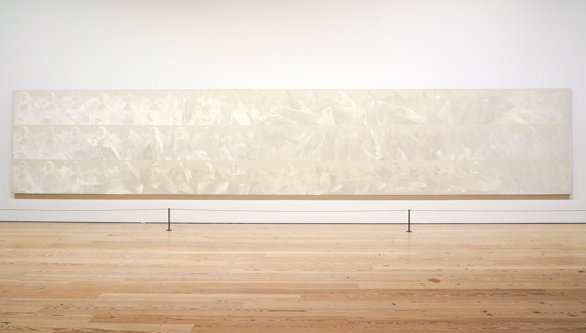
White Flag, 1955Johns said that one night in 1954 “I dreamed that I painted a large American flag, and the next morning I got up and I went out and bought the materials to begin it. And I did.” Johns has long been drawn to images seen in dreams, thi…

White Flag, 1955

Johns said that one night in 1954 “I dreamed that I painted a large American flag, and the next morning I got up and I went out and bought the materials to begin it. And I did.” Johns has long been drawn to images seen in dreams, things he briefly sees from the window of a speeding car, concrete imagery grasped from fleeting sources. Johns has always insisted there is no political content in the flag paintings, he simply dreamed about painting a flag and set about doing that when he woke up. The idea here is to look at the flag as an object: to really see it, not as a symbol of something else, but to see it for the first time as an object, an aesthetic object, referencing nothing other than itself. You are now looking actively, you are appreciating the proportions of the flag and the geometry and you might even start thinking of how humans invest so much in signs and symbols. When the flag paintings were first shown in 1958, before the dawn of Pop Art, many people did not see it as art. The idea of simply painting a flag or a map required no artistic vision, expression, or talent, it was nothing more than banality disguised as art. Yet this was a significant step away from the tortured brushwork of abstract expressionism as much as it was a rejection of figurative painting meant to use the canvas as a window onto a representational world. The painting of a flag is both a representation of a flag and a flag in its own right, similar to the target in the previous gallery. He created his first flag on a bedsheet, using newspaper as a collage medium, along with enamel paint that he soon replaced with encaustic, a medium consisting of pigment mixed into wax melted on a hot plate which hardens quickly as it cools and records each stroke of the artist’s brush. There is something sensual about encaustic, it seems warm and soft like skin or edible like food. By appropriating a preexisting image, a thing “the mind already knows,” Johns can devote his creative energy to manipulating the known image in a way that makes the viewer see it with fresh eyes. White Flag is composed of three separate canvases that support layers of encaustic, oil paint, newsprint and charcoal. It is the first Jasper Johns painting purchased by the Metropolitan Museum of Art, which surprisingly waited until 1998 to include one of his paintings in their collection.

Map, 1961Johns is most well-known for the works in this gallery: by depicting things like flags, numbers, and maps, he utilizes images we think we know so well that they are, in effect invisible, and he asks us to look again and know them anew. Johns is asking us to be more reflective in our seeing, to be more mindful of the world around us, to see the world with the eye of an artist or a poet. Pre-COVID, this show was originally going to open in the fall of 2020 in the midst of the presidential election, and the gallery filled with maps and flags of the United States in color on one side and in black and white on the other was going to comment on how divided the country is.  In 1960 Johns painted his first map directly on top of a small mimeographed map of the states used by school children given to him by Robert Rauschenberg. Like a flag, a political map represents aspects of the nation that cannot be seen, they are a visual summation of the idea of a nation, although in this case the boundaries are only suggested and the map could never be of use as such. In a sense this ties into the idea of our internal archaeology of symbols: most Americans can summon up a vague image of the map of the country, but, asked to draw it on a piece of paper, it may well look like this painting.  Map 1963 had to be removed by crane from the apartment of a private collector who loaned the work: its large size reflects the ambition of the young artist. Directly opposite is Map 1961, which is a map with the names of states blurred and stripped of not only boundaries but colors suggesting a differentiation between states. The part of the map we will focus on next is South Carolina.

Map, 1961

Johns is most well-known for the works in this gallery: by depicting things like flags, numbers, and maps, he utilizes images we think we know so well that they are, in effect invisible, and he asks us to look again and know them anew. Johns is asking us to be more reflective in our seeing, to be more mindful of the world around us, to see the world with the eye of an artist or a poet. Pre-COVID, this show was originally going to open in the fall of 2020 in the midst of the presidential election, and the gallery filled with maps and flags of the United States in color on one side and in black and white on the other was going to comment on how divided the country is.

In 1960 Johns painted his first map directly on top of a small mimeographed map of the states used by school children given to him by Robert Rauschenberg. Like a flag, a political map represents aspects of the nation that cannot be seen, they are a visual summation of the idea of a nation, although in this case the boundaries are only suggested and the map could never be of use as such. In a sense this ties into the idea of our internal archaeology of symbols: most Americans can summon up a vague image of the map of the country, but, asked to draw it on a piece of paper, it may well look like this painting.  Map 1963 had to be removed by crane from the apartment of a private collector who loaned the work: its large size reflects the ambition of the young artist. Directly opposite is Map 1961, which is a map with the names of states blurred and stripped of not only boundaries but colors suggesting a differentiation between states. The part of the map we will focus on next is South Carolina.

Place: South Carolina

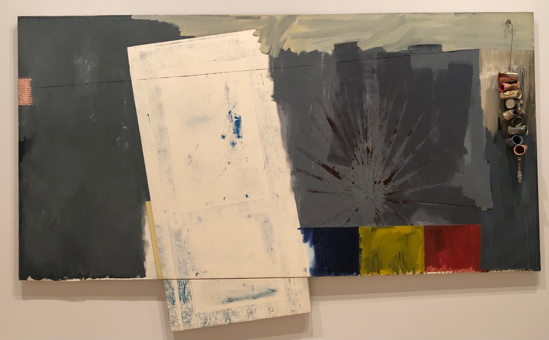
Studio, 1964Other than New York, the two places that have most influenced Jasper Johns is his native South Carolina, addressed at the Whitney, and Japan, featured at the sister show at the Philadelphia Museum of Art. The South Carolina gallery is divided into works he created at a studio in Edisto Island in the 60s and work created years later in the 90s reflecting on his childhood in 1930s Columbia. He arrived in Edisto Island in the early 60s after breaking up with Rauschenberg, and the work from that time channels the beach as a place of loss and desire. Studio, the first Jasper Johns work purchased by the Whitney, reflects the sun and beach light after years of living in New York City. There is no clear subject matter here as there was in the previous gallery: instead we have the same luscious brushwork along with cans hanging on the canvas that we want to reach out and touch, the same way we might have wanted to touch the faces or lower the lid in the target work or run our fingers over the flag. There are direct impressions on the canvas made by a screen door that was painted with blue paint and pressed against the canvas as well as a palmetto frond from his yard that was painted red and pressed to the canvas along with studio detritus like beer cans used for mixing paint and used paint brushes.  Johns probably got the idea of pressing objects onto a canvas from Rauschenberg, who saw it as a quick way to draw to scale in an impersonal way. Johns had thought he would get more work done away from the temptations and pressures of New York, but he actually found life in Edisto to be so relaxing and pleasant that he found himself working less. In 1966 the Edisto studio burned down while Johns was in Japan and he lost everything that was in the house, including his artwork and the artwork he owned by other artists. There are vitrines in the gallery with inventories drawn up for the insurance claims which give you an idea of what Johns had in the house.  Johns never rebuilt the studio and returned to the northeast to live permanently: his beach house is now in Saint Martin. 

Studio, 1964

Other than New York, the two places that have most influenced Jasper Johns is his native South Carolina, addressed at the Whitney, and Japan, featured at the sister show at the Philadelphia Museum of Art. The South Carolina gallery is divided into works he created at a studio in Edisto Island in the 60s and work created years later in the 90s reflecting on his childhood in 1930s Columbia. He arrived in Edisto Island in the early 60s after breaking up with Rauschenberg, and the work from that time channels the beach as a place of loss and desire. Studio, the first Jasper Johns work purchased by the Whitney, reflects the sun and beach light after years of living in New York City. There is no clear subject matter here as there was in the previous gallery: instead we have the same luscious brushwork along with cans hanging on the canvas that we want to reach out and touch, the same way we might have wanted to touch the faces or lower the lid in the target work or run our fingers over the flag. There are direct impressions on the canvas made by a screen door that was painted with blue paint and pressed against the canvas as well as a palmetto frond from his yard that was painted red and pressed to the canvas along with studio detritus like beer cans used for mixing paint and used paint brushes.  Johns probably got the idea of pressing objects onto a canvas from Rauschenberg, who saw it as a quick way to draw to scale in an impersonal way. Johns had thought he would get more work done away from the temptations and pressures of New York, but he actually found life in Edisto to be so relaxing and pleasant that he found himself working less. In 1966 the Edisto studio burned down while Johns was in Japan and he lost everything that was in the house, including his artwork and the artwork he owned by other artists. There are vitrines in the gallery with inventories drawn up for the insurance claims which give you an idea of what Johns had in the house.  Johns never rebuilt the studio and returned to the northeast to live permanently: his beach house is now in Saint Martin. 

Constellations: According to What

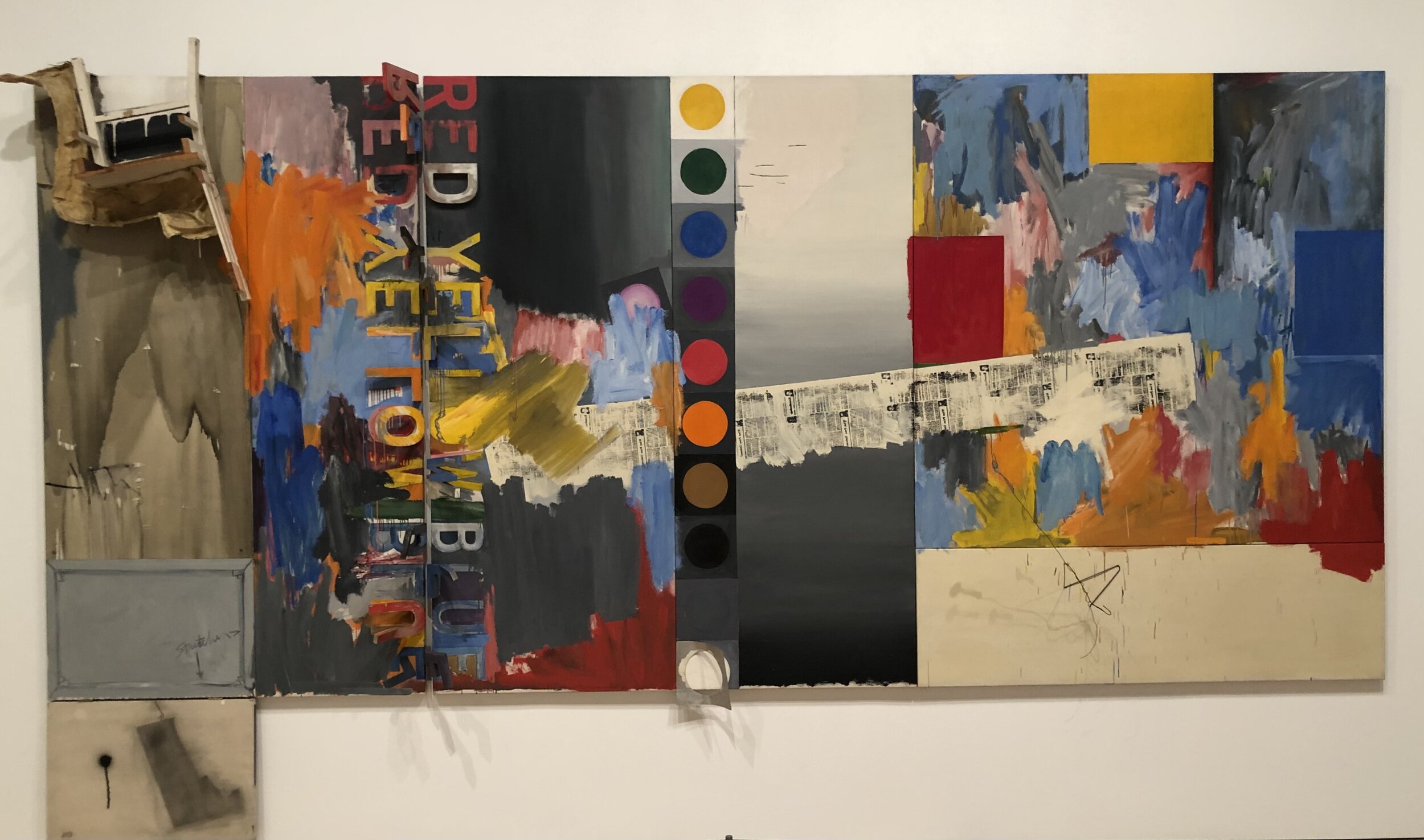
According to What, 1964Until the early 60s Johns had focused on a single image, whether it be a target, a flag, a map, etc. in which the surface of the work was consistent throughout in terms of materials and palette. Johns considered paintings after this to be less “intellectual” and more focused on the materials and actions used to create them. Inspired by Rauschenberg’s Combines, the new work incorporated multiple pictorial spaces, materials, and styles. Rather than referencing common imagery recognizable to all, Johns began using imagery that had meaning to him personally which meant the meaning of his work necessarily became more enigmatic to viewers. According to What is an example of one of these works in which prior motifs and personal iconography are combined on multiple panels. In this case, the six panels measure seven by sixteen feet and are anchored compositionally and conceptually by the silhouette of Marcel Duchamp in the lower left, a copy of Duchamp’s Self Portrait in Profile. Duchamp’s use of readymades and incorporation of language became a lifelong inspiration for Johns. Johns discovered Duchamp after several reviewers labeled his work neo-Dada because they resembled Duchamp’s Dadaist use of readymades like urinals, snow shovels, and bottle racks. By signing a urinal Duchamp made a radical statement that something could be considered art if it was designated as such by an artist. By naming something as art, the artist emphasized the linguistic nature of naming an object. Johns and Rauschenberg went to Philadelphia to see Duchamp’s work in person in the Arensberg Collection at the Philadelphia Museum of Art. Duchamp was also interested in shadows, especially those cast by people, because they are a thing that exists in the world that is related to you, but is separate from you. This picture is full of shadows, including a spoon casting an actual shadow and a hangar casting a shadow that is actually drawn on the canvas by the artist. Johns combines found objects with two dimensional representation: the work includes a cast of a leg bent at the knee and a kitchen chair as well as a twisted coat hanger, metal swinging letters, painted circles of color that are reminiscent of color scales, expressive brushwork, silkscreened newsprint discussing the Kremlin and a hinged canvas with the profile of Marcel Duchamp. To a certain extent, Johns is asking more active participation from the viewer than he was when using an immediately recognizable image like a flag or a target: the viewer needs to interpret the meaning, decipher clues, expend mental effort, and invest time. The idea that a viewer completes the meaning of a work was central to Duchamp and inspired not only Johns but also colleagues in other artistic fields like John Cage and Merce Cunningham. Originally, Johns intended this work to be manipulated directly by the viewer, to move the letters spelling out Red, Yellow, and Blue on their hinges and to open and close the Duchamp silhouette. Johns returned to According to What repeatedly over time, revising the work as he came back to it during multiple viewings, incorporating imagery from previous work, read and painted words, printing, found objects, and abstraction. The work synthesizes previous work and points the way toward future directions. None of this ambition would have been possible without Leo Castelli, who we will discuss in the next gallery.

According to What, 1964

Until the early 60s Johns had focused on a single image, whether it be a target, a flag, a map, etc. in which the surface of the work was consistent throughout in terms of materials and palette. Johns considered paintings after this to be less “intellectual” and more focused on the materials and actions used to create them. Inspired by Rauschenberg’s Combines, the new work incorporated multiple pictorial spaces, materials, and styles. Rather than referencing common imagery recognizable to all, Johns began using imagery that had meaning to him personally which meant the meaning of his work necessarily became more enigmatic to viewers. According to What is an example of one of these works in which prior motifs and personal iconography are combined on multiple panels. In this case, the six panels measure seven by sixteen feet and are anchored compositionally and conceptually by the silhouette of Marcel Duchamp in the lower left, a copy of Duchamp’s Self Portrait in Profile. Duchamp’s use of readymades and incorporation of language became a lifelong inspiration for Johns. Johns discovered Duchamp after several reviewers labeled his work neo-Dada because they resembled Duchamp’s Dadaist use of readymades like urinals, snow shovels, and bottle racks. By signing a urinal Duchamp made a radical statement that something could be considered art if it was designated as such by an artist. By naming something as art, the artist emphasized the linguistic nature of naming an object. Johns and Rauschenberg went to Philadelphia to see Duchamp’s work in person in the Arensberg Collection at the Philadelphia Museum of Art. Duchamp was also interested in shadows, especially those cast by people, because they are a thing that exists in the world that is related to you, but is separate from you. This picture is full of shadows, including a spoon casting an actual shadow and a hanger casting a shadow that is actually drawn on the canvas by the artist. Johns combines found objects with two dimensional representation: the work includes a cast of a leg bent at the knee and a kitchen chair as well as a twisted coat hanger, metal swinging letters, painted circles of color that are reminiscent of color scales, expressive brushwork, silkscreened newsprint discussing the Kremlin and a hinged canvas with the profile of Marcel Duchamp. To a certain extent, Johns is asking more active participation from the viewer than he was when using an immediately recognizable image like a flag or a target: the viewer needs to interpret the meaning, decipher clues, expend mental effort, and invest time. The idea that a viewer completes the meaning of a work was central to Duchamp and inspired not only Johns but also colleagues in other artistic fields like John Cage and Merce Cunningham. Originally, Johns intended this work to be manipulated directly by the viewer, to move the letters spelling out Red, Yellow, and Blue on their hinges and to open and close the Duchamp silhouette. Johns returned to According to What repeatedly over time, revising the work as he came back to it during multiple viewings, incorporating imagery from previous work, read and painted words, printing, found objects, and abstraction. The work synthesizes previous work and points the way toward future directions. None of this ambition would have been possible without Leo Castelli, who we will discuss in the next gallery.

Display: Castelli, 1968

Harlem Light, 1967While many artists of his generation saw integrating their work, both thematically and physically, into an architectural space as an integral part of their process, Johns has been more interested in creating work than how it is displayed in subsequent exhibitions. This retrospective was no different: Johns gave the curators the freedom to use whatever works they wanted in whatever way they wanted to display them. On two occasions while at Leo Castelli’s gallery, Johns was more actively involved in the display of his work. One of these shows is recreated at the Whitney, the other at the Philadelphia Museum of Art. Castelli’s gallery was located on the second floor of a townhouse at 4 East 77th Street in a relatively compact space measuring 25 x 21 feet with 12 foot ceilings. Shortly after founding his gallery in 1957, Leo Castelli met Johns while visiting Rauchenberg’s adjoining studio. Castelli offered Johns a solo show on the spot, and this sold out show in January of 1958 made him an instant star after previously only showing in small group exhibitions.  The gallery at the Whitney reproduces the size and scope of a 1968 show at Castelli where the six works are tied together by the theme of industry and architecture. The dimensions of the gallery are the same as at Castelli’s, the ceiling height of the townhouse is marked off on the wall and the door is located in the same spot. The work in this Castelli show, produced between 1966 and 1968, consists of dark works hung vertically with a barely discernible image of a hanging spoon and fork with written instructions indicating that the fork should be reproduced “7” inches long. In referencing measurements and measuring instruments, Johns is interested in the idea of breaking space up into arbitrary units, seeing it as akin to mapping or creating a flag as a symbol for a country. The dark vertical works are offset by large horizontal works that are lighter and more visually varied with recurring motifs of imprints of a screen door, rulers, and multicolored impasto flagstones inspired by John’s memory of a wall he passed in Harlem while in a taxi on the way to the airport painted as if it were made of stones.  When he went back to find the wall he couldn’t find it and concluded that it had been painted over so he recreated it from memory. We will take a break from obscure references to spoon sizes and things seen from speeding cars in a room full of prints displaying a more spontaneous sense of play.

Harlem Light, 1967

While many artists of his generation saw integrating their work, both thematically and physically, into an architectural space as an integral part of their process, Johns has been more interested in creating work than how it is displayed in subsequent exhibitions. This retrospective was no different: Johns gave the curators the freedom to use whatever works they wanted in whatever way they wanted to display them. On two occasions while at Leo Castelli’s gallery, Johns was more actively involved in the display of his work. One of these shows is recreated at the Whitney, the other at the Philadelphia Museum of Art. Castelli’s gallery was located on the second floor of a townhouse at 4 East 77th Street in a relatively compact space measuring 25 x 21 feet with 12 foot ceilings. Shortly after founding his gallery in 1957, Leo Castelli met Johns while visiting Rauchenberg’s adjoining studio. Castelli offered Johns a solo show on the spot, and this sold out show in January of 1958 made him an instant star after previously only showing in small group exhibitions.  The gallery at the Whitney reproduces the size and scope of a 1968 show at Castelli where the six works are tied together by the theme of industry and architecture. The dimensions of the gallery are the same as at Castelli’s, the ceiling height of the townhouse is marked off on the wall and the door is located in the same spot. The work in this Castelli show, produced between 1966 and 1968, consists of dark works hung vertically with a barely discernible image of a hanging spoon and fork with written instructions indicating that the fork should be reproduced “7” inches long. In referencing measurements and measuring instruments, Johns is interested in the idea of breaking space up into arbitrary units, seeing it as akin to mapping or creating a flag as a symbol for a country. The dark vertical works are offset by large horizontal works that are lighter and more visually varied with recurring motifs of imprints of a screen door, rulers, and multicolored impasto flagstones inspired by John’s memory of a wall he passed in Harlem while in a taxi on the way to the airport painted as if it were made of stones.  When he went back to find the wall he couldn’t find it and concluded that it had been painted over so he recreated it from memory. We will take a break from obscure references to spoon sizes and things seen from speeding cars in a room full of prints displaying a more spontaneous sense of play.

Unique Prints: Savarin Monotypes

Savarin, 1982

Savarin, 1982

Unlike many artists, Johns is not interested in printmaking as a means of making exact reproductions of an image. Often the creation of a print is only a preliminary step before Johns proceeds to alter it in a long series of “trial proofs” where he tries out the design using different papers and colors and “working proofs” which he sometimes alters by hand. Johns sees each iteration of a changing print as a finished work of art it in its own right and he has 2,400 of these proofs in his possession. Painting the same image multiple times requires planning and working entirely by hand while making multiple prints of an image is much less time consuming and allows a sense of creative play as ideas are easily assayed and assessed. He also began working with monotypes in 1978, which are one off prints made by painting or drawing directly onto a plate, often of plexiglass, which is then printed onto a sheet of paper. In 1982 he created thirty three of these monotypes in the Savarin series, inspired by his cast sculpture of a Savarin coffee can filled with paint brushes, which is generally considered a self portrait. Johns had created an edition of lithograph prints of the Savarin can but was unhappy with the paper it was printed on so over the course of four days he overlaid the rejected prints with monotypes. He applied ink directly to Plexiglas plates and then held them over the lithographs so that he could see where the ink would end up on the print below. The process gave Johns free rein to play with ideas on the fly, adding colors to crosshatches with his fingers, daubing the coffee cans with the tips of his fingers, or overlaying an oval vignette framing suggesting the Savarin can as a self portrait. Some of the monotypes are overlaid with what looks like stars but are actually the result of paint remover dripped on the ink. Two of the prints say “Hallelujah!” as Johns came to the end of the process, and the final monotype in the series came about by running a monotype through and then using the plate a second time to reverse the image mirrored in a more faded form. We will consider the mirroring of images by hand on canvas next.

Mind/Mirror

Spring, 1986As Johns entered his 50s in the 1980s, he began producing work with highly personal references that allude to memories and nostalgia, intimate domestic spaces like his bathroom, his shadow, as well as personally resonate art history, including the work of Leonardo DaVinci, Matthias Grunewald, pieces Johns owns by Barnett Newman and George Ohr, popular images that play with the perception of the viewer, and a vase commemorating Queen Elizabeth II’s Silver Jubilee. Johns became interested in perceptual puzzles through Marcel Duchamp because they are in keeping with his interest in active looking, perceiving a flag or a map like you have never seen one before is similar to looking at a picture of a rabbit only to realize that it could also be the head of a duck. Johns finds it interesting that your mind doesn’t allow you so see both the rabbit and the duck simultaneously, which echoes the earlier challenge of seeing a painting of a flag and also a flag in and of itself at the same time. Vision consists of sensation and perception, there is the light on your retina but it takes your mind to perceive it and make sense of the image. This accretion of personal items is heightened by images seemingly tacked or taped onto the canvas. Works from this period are also often paired with identical or highly similar works painted with a different palette or with a different medium. Seasons pairs off Summer and Winter and Spring and Fall where the two seasons in question are depicted as closely related variants. The Whitney is showing Spring and Fall, Philadelphia got Summer and Winter. Both paintings feature Johns’ shadow that he had an assistant trace and cut out. Spring includes the shadow of a boy, which, placed below the shadow of the adult Johns, seems to indicate a reflection on childhood and aging. Lines slanting across the canvas suggest springtime rain and growth, as does the rabbit/duck perceptual puzzle familiar from childhood.

Spring, 1986

As Johns entered his 50s in the 1980s, he began producing work with highly personal references that allude to memories and nostalgia, intimate domestic spaces like his bathroom, his shadow, as well as personally resonate art history, including the work of Leonardo DaVinci, Matthias Grunewald, pieces Johns owns by Barnett Newman and George Ohr, popular images that play with the perception of the viewer, and a vase commemorating Queen Elizabeth II’s Silver Jubilee. Johns became interested in perceptual puzzles through Marcel Duchamp because they are in keeping with his interest in active looking, perceiving a flag or a map like you have never seen one before is similar to looking at a picture of a rabbit only to realize that it could also be the head of a duck. Johns finds it interesting that your mind doesn’t allow you so see both the rabbit and the duck simultaneously, which echoes the earlier challenge of seeing a painting of a flag and also a flag in and of itself at the same time. Vision consists of sensation and perception, there is the light on your retina but it takes your mind to perceive it and make sense of the image. This accretion of personal items is heightened by images seemingly tacked or taped onto the canvas. Works from this period are also often paired with identical or highly similar works painted with a different palette or with a different medium. Seasons pairs off Summer and Winter and Spring and Fall where the two seasons in question are depicted as closely related variants. The Whitney is showing Spring and Fall, Philadelphia got Summer and Winter. Both paintings feature Johns’ shadow that he had an assistant trace and cut out. Spring includes the shadow of a boy, which, placed below the shadow of the adult Johns, seems to indicate a reflection on childhood and aging. Lines slanting across the canvas suggest springtime rain and growth, as does the rabbit/duck perceptual puzzle familiar from childhood.

Fall, 1986

Fall, 1986

Racing Thoughts, 1983Johns has always had an interest in presenting multiple versions of the same image, whether in color or in black and white as we saw with the map paintings, using encaustic or oil as with the flags, making a sculpture and using …

Racing Thoughts, 1983

Johns has always had an interest in presenting multiple versions of the same image, whether in color or in black and white as we saw with the map paintings, using encaustic or oil as with the flags, making a sculpture and using that as the basis of a print, etc. Racing Thoughts is shown here done in a colored encaustic with its attendant buildup of texture and then in a grisaille in a thin layer of oil. As with so many of his works, Racing Thoughts is replete with autobiographical and art historical references with the title suggesting an onrush of mental anxiety or creativity. Johns has described the process of painting as being a conversation with yourself as well as with other painters, and he incorporates the works of others as they come to mind in the creative process both as a way of paying tribute and a means of unsuccessfully exorcising them from his memory. Neuroscience has found that the creative process is closely tied to memory: that to be in the creative flow requires the prefrontal cortex to disengage from active problem solving in the immediate present so that the brain can begin making free floating associations which are inherently based on memories of past experiences.

Racing Thoughts, 1984The setting is Johns’ bathtub: we see the running faucet and his clothing hanging on the wall evoking the flayed skin self portrait of Michelangelo in the Last Judgement segment of the Sistine Chapel.  The wall  has the outlines of an upside down figure from the Isenheim Alterpiece. A laundry hamper serves as a platform for a pot by ceramicist George Ohr and a vase with the profiles of Queen Elizabeth and Prince Philip from the Queen’s Silver Jubilee in 1977. There is a jigsaw puzzle of an old passport photo of Leo Castelli owned by Johns, a Barnett Newman lithograph and a reproduction of the Mona Lisa by Leonardo DaVinci, who Johns greatly admires.  But as Johns relaxes in the tub reflecting on artists he admires, a man who made his career, and ceramics he enjoys owning, we have the memento mori of a sign warning of falling ice with a skull and crossbones. Daydreaming on the past continues in a more dreamlike way in the next gallery.

Racing Thoughts, 1984

The setting is Johns’ bathtub: we see the running faucet and his clothing hanging on the wall evoking the flayed skin self portrait of Michelangelo in the Last Judgement segment of the Sistine Chapel.  The wall  has the outlines of an upside down figure from the Isenheim Alterpiece. A laundry hamper serves as a platform for a pot by ceramicist George Ohr and a vase with the profiles of Queen Elizabeth and Prince Philip from the Queen’s Silver Jubilee in 1977. There is a jigsaw puzzle of an old passport photo of Leo Castelli owned by Johns, a Barnett Newman lithograph and a reproduction of the Mona Lisa by Leonardo DaVinci, who Johns greatly admires.  But as Johns relaxes in the tub reflecting on artists he admires, a man who made his career, and ceramics he enjoys owning, we have the memento mori of a sign warning of falling ice with a skull and crossbones. Daydreaming on the past continues in a more dreamlike way in the next gallery.

Dreams

Montez Singing, 1989Moving from the crosshatches of the 70s and 80s, Johns began pursuing very different themes in the 80s and 90s that delve into the subconscious and irrational. The whimsy of dreams is represented at the Whitney, while the horror of nightmares, especially around the AIDS epidemic, are being shown in Philadelphia. Works in the “Dreams” gallery at the Whitney often feature a woman’s profile and her disembodied eyes from a Picasso painting, Straw Hat with Blue Leaves. Many works feature the precise outline of a form that has long been mysterious but was recently discovered to be an ancient sculpture called the Green Angel, although Johns refuses to confirm that as the source. In Montez Singing, the eyes and nose from the Picasso along with a pair of lips suggest the elements of a face regarding each other or a surreal landscape with the lips suggesting mountains, the nose a cloud and the eyes celestial orbs. The reference to Picasso is also a reference to perceptual challenges in line with duck/rabbit puzzles and seeing a crosshatch pattern briefly in a passing car. Picasso was exploring the ways we piece together knowledge of a face through the multiple angles in which we view it. Johns takes Picasso’s work and takes a more extreme step, wrenching out features like individual eyeballs and lips and placing them in a way that in no way resembles a human face. Wispy brush strokes along the edge suggest hair and the circles breasts. In the midst of these anatomical shapes Johns includes a simple picture of a sailboat seemingly hanging from a nail and wire. The sailboat and the title of the work, Montez Singing, refers to his step-grandmother who would play the piano and sing “Red Sails in the Sunset” when Johns lived in his grandfather’s house a boy. The large bulbous eyes and cartoon like nail are also a reference to Philip Guston, whose cartoon-like late work appealed to Johns as a mixture of melancholy and comedy. Johns has also expressed his interest in children’s drawings as being the purest origin of art, and the aesthetics of a child’s drawing is clear here. We have the textural, sculptural feel of the encaustic work: we will see actual sculptures in the next gallery.

Montez Singing, 1989

Moving from the crosshatches of the 70s and 80s, Johns began pursuing very different themes in the 80s and 90s that delve into the subconscious and irrational. The whimsy of dreams is represented at the Whitney, while the horror of nightmares, especially around the AIDS epidemic, are being shown in Philadelphia. Works in the “Dreams” gallery at the Whitney often feature a woman’s profile and her disembodied eyes from a Picasso painting, Straw Hat with Blue Leaves. Many works feature the precise outline of a form that has long been mysterious but was recently discovered to be an ancient sculpture called the Green Angel, although Johns refuses to confirm that as the source. In Montez Singing, the eyes and nose from the Picasso along with a pair of lips suggest the elements of a face regarding each other or a surreal landscape with the lips suggesting mountains, the nose a cloud and the eyes celestial orbs. The reference to Picasso is also a reference to perceptual challenges in line with duck/rabbit puzzles and seeing a crosshatch pattern briefly in a passing car. Picasso was exploring the ways we piece together knowledge of a face through the multiple angles in which we view it. Johns takes Picasso’s work and takes a more extreme step, wrenching out features like individual eyeballs and lips and placing them in a way that in no way resembles a human face. Wispy brush strokes along the edge suggest hair and the circles breasts. In the midst of these anatomical shapes Johns includes a simple picture of a sailboat seemingly hanging from a nail and wire. The sailboat and the title of the work, Montez Singing, refers to his step-grandmother who would play the piano and sing “Red Sails in the Sunset” when Johns lived in his grandfather’s house a boy. The large bulbous eyes and cartoon like nail are also a reference to Philip Guston, whose cartoon-like late work appealed to Johns as a mixture of melancholy and comedy. Johns has also expressed his interest in children’s drawings as being the purest origin of art, and the aesthetics of a child’s drawing is clear here. We have the textural, sculptural feel of the encaustic work: we will see actual sculptures in the next gallery.

Recent Sculptures

Numbers, 2007 (cast 2008)This sculpture from 2007 seeks to replicate an older version commissioned by architect Philip Johnson in 1964 for the opening of the New York State Theater at the new Lincoln Center for the Performing Arts. The 1964 sculpture was made at a time when Johns was using number stencils and was created from sculp-metal, a metallic putty that air hardens into solid metal, a process reminiscent of encaustic where liquid wax hardens as it cools.  The New York State Theater, now the David H. Koch Theater, is the home of the New York City Ballet and other dance troupes and Johns slyly referenced this by putting an impression of the foot of his friend Merce Cunningham at the upper right because he thought it would be a perfect way to get Cunningham’s foot in the door of the building where the New York City dance world would congregate. In 1999 Lincoln Center was going to sell the sculpture to raise money and Jasper Johns, Philip Johnson, and others protested because the work was made specifically for that space and is the only public work Johns has produced.  Lincoln Center yielded to pressure and did not sell the sculpture, but Johns has noted that once they found out it was worth an estimated $15 million they decided to encase it in Plexiglass and cordon it off with ropes despite the fact that Johns purposely made it out of durable metal. With this experience in mind he asked if he could make a cast from the original but the owners refused so he decided to recreate the work from scratch “since I knew how.” Like flags and maps, numbers appeal to Johns as things the mind already knows that can be manipulated and reinterpreted in endless ways. Unlike maps and flags, numbers can be overlaid and naturally lend themselves to the idea of exponential growth and are free of any set scale or color. Once again, we have an example of a stunningly beautiful object with perfect texture and patina that we want to reach out and touch: there is a definite sensuality at play along with a sense of reassuring order as we vaguely perceive the arrangement of the numbers. As with the flag paintings, we are appreciating the aesthetics of numerals devoid of their meaning. Neuroscience has found that the appeal of visual arts is a close tie to the reading of texture: looking and touching, even if we do not have the ability to actually touch (think of the objects in a Dutch still life), we understand what we are seeing partly by understanding what we are seeing feels like as we run our hand over it.  The 2007 sculpture was cast in wax and then into aluminum with the numbers going up sequentially starting from the upper left, where the first panel is left blank. For the 2007 edition Johns recast Cunningham’s foot. While a foundry handled the casting Johns added the polishing and patina himself. Johns used the now slightly damaged wax numbers left from the casting process to create the six smaller works in the gallery cast in bronze, aluminum, and silver. They can be displayed on a plinth as you see in the gallery or hung on a wall. There are keys embedded in the silver sculpture, probably a reference to those seeking to decode the myriad references in Johns’ work while the copper piece includes a prominent footprint and a classified ad for sex services and the bronze sculpture has impressions of a screen, echoing earlier work.  In the final gallery we will return to works on canvas as Johns contemplates the end of a long life.

Numbers, 2007 (cast 2008)

This sculpture from 2007 seeks to replicate an older version commissioned by architect Philip Johnson in 1964 for the opening of the New York State Theater at the new Lincoln Center for the Performing Arts. The 1964 sculpture was made at a time when Johns was using number stencils and was created from sculp-metal, a metallic putty that air hardens into solid metal, a process reminiscent of encaustic where liquid wax hardens as it cools.  The New York State Theater, now the David H. Koch Theater, is the home of the New York City Ballet and other dance troupes and Johns slyly referenced this by putting an impression of the foot of his friend Merce Cunningham at the upper right because he thought it would be a perfect way to get Cunningham’s foot in the door of the building where the New York City dance world would congregate. In 1999 Lincoln Center was going to sell the sculpture to raise money and Jasper Johns, Philip Johnson, and others protested because the work was made specifically for that space and is the only public work Johns has produced.  Lincoln Center yielded to pressure and did not sell the sculpture, but Johns has noted that once they found out it was worth an estimated $15 million they decided to encase it in Plexiglass and cordon it off with ropes despite the fact that Johns purposely made it out of durable metal. With this experience in mind he asked if he could make a cast from the original but the owners refused so he decided to recreate the work from scratch “since I knew how.” Like flags and maps, numbers appeal to Johns as things the mind already knows that can be manipulated and reinterpreted in endless ways. Unlike maps and flags, numbers can be overlaid and naturally lend themselves to the idea of exponential growth and are free of any set scale or color. Once again, we have an example of a stunningly beautiful object with perfect texture and patina that we want to reach out and touch: there is a definite sensuality at play along with a sense of reassuring order as we vaguely perceive the arrangement of the numbers. As with the flag paintings, we are appreciating the aesthetics of numerals devoid of their meaning. Neuroscience has found that the appeal of visual arts is a close tie to the reading of texture: looking and touching, even if we do not have the ability to actually touch (think of the objects in a Dutch still life), we understand what we are seeing partly by understanding what we are seeing feels like as we run our hand over it. The 2007 sculpture was cast in wax and then into aluminum with the numbers going up sequentially starting from the upper left, where the first panel is left blank. For the 2007 edition Johns recast Cunningham’s foot. While a foundry handled the casting Johns added the polishing and patina himself. Johns used the now slightly damaged wax numbers left from the casting process to create the six smaller works in the gallery cast in bronze, aluminum, and silver. They can be displayed on a plinth as you see in the gallery or hung on a wall. There are keys embedded in the silver sculpture, probably a reference to those seeking to decode the myriad references in Johns’ work while the copper piece includes a prominent footprint and a classified ad for sex services and the bronze sculpture has impressions of a screen, echoing earlier work.  In the final gallery we will return to works on canvas as Johns contemplates the end of a long life.

Elegies in Dark

Catenary (I Call to the Grave), 1998In 1996-97 the Museum of Modern Art had a Jasper Johns retrospective and the experience of taking stock in his life and career as he approached his 70s seems to have spurred a change from the light hearted dream inspired works to work reflecting on mortality and loss in his Catenary series, named for the curve in strings suspended from two fixed points across the canvases.  The paintings are encaustic and collage on canvas and almost entirely gray in tone, similar to works he created four decades earlier seen in the first gallery, but filled with an elegiac dignity instead of a more youthful angry despair. The fragility of the simple unadorned thread as it rises across the field of view suggests the arc of a life and its inherent vulnerability no matter how successful or seemingly secure. The title of Catenary (I Call to the Grave) quotes the Book of Job when the prophet contemplates death and suffering, wondering if the grave is the only end to his troubles. While the quote is from Job, the pronoun suggests Johns, whose signature is prominent on the canvas, calling to the grave himself.  

Catenary (I Call to the Grave), 1998

In 1996-97 the Museum of Modern Art had a Jasper Johns retrospective and the experience of taking stock of his life and career as he approached his 70s seems to have spurred a change from the light hearted dream inspired works to work reflecting on mortality and loss in his Catenary series, named for the curve in strings suspended from two fixed points across the canvases.  The paintings are encaustic and collage on canvas and almost entirely gray in tone, similar to works he created four decades earlier seen in the first gallery, but filled with an elegiac dignity instead of a more youthful angry despair. The fragility of the simple unadorned thread as it rises across the field of view suggests the arc of a life and its inherent vulnerability no matter how successful or seemingly secure. The title of Catenary (I Call to the Grave) quotes the Book of Job when the prophet contemplates death and suffering, wondering if the grave is the only end to his troubles. While the quote is from Job, the pronoun suggests Johns, whose signature is prominent on the canvas, calling to the grave himself.  Ever since destroying early work he felt was too emotional when young, Johns has maintained an air of reserve, eschewing a celebrity artist life in the mold of his contemporary Andy Warhol. Here Johns expresses a quiet melancholy clouded in gray with barely discernible lettering quoting an obscure biblical passage like a quiet whisper that forces us to listen more carefully than something spoken in a louder tone.

Slice, 2020Slice was completed during COVID-19 and is his most recent painting. It features a drawing of the anatomy of a knee drawn by a 17 year old boy. The boy had torn his knee playing soccer and gave the drawing, based on an image he found on the internet, to the orthopedic surgeon treating him, who hung it in his office. Johns goes to the same orthopedist and liked the drawing enough to superimpose it on a 1986 star map called “Slice of the Universe” showing the distribution of nearby galazies sent to Johns by the astrophysicist Margaret Geller in 2018. Johns likes the image because the galaxies resemble a stick man in the middle. “Slice of the Universe” and the drawing of the knee are, in turn, superimposed over knot drawings by Leonardo da Vinci. Johns is therefore panning out from the viscera of an aching knee to the structure of the cosmos with knots created by an artist who seemed to balance the human and the cosmic more than any other before or since. Johns has said in recent interviews that over the past few decades he thought he was working on his final projects only to find that that was not the case. At 91 he knows that the final project in inevitably near at hand, but thankfully for all of us he will continue his creative engagement with the world around him until the end.

Slice, 2020

Slice was completed during COVID-19 and is his most recent painting and embodies his penchant for incorporating elements that are designed by others, items that he takes readymade from the world around him and are, in a way he finds creatively compelling, not his. It features a drawing of the anatomy of a knee drawn by a 17 year old boy. The boy had torn his knee playing soccer and gave the drawing, based on an image he found on the internet, to the orthopedic surgeon treating him, who hung it in his office. Johns goes to the same orthopedist and liked the drawing enough to superimpose it on a 1986 star map called “Slice of the Universe” showing the distribution of nearby galazies sent to Johns by the astrophysicist Margaret Geller in 2018. Johns likes the image because the galaxies resemble a stick man in the middle. “Slice of the Universe” and the drawing of the knee are, in turn, superimposed over knot drawings by Leonardo da Vinci. Johns is therefore panning out from the viscera of an aching knee to the structure of the cosmos with knots created by an artist who seemed to balance the human and the cosmic more than any other before or since. Johns has said in recent interviews that over the past few decades he thought he was working on his final projects only to find that that was not the case. At 91 he knows that the final project is inevitably near at hand, but thankfully for all of us he will continue his creative engagement with the world around him until the end.

“…the past is beautiful because one never realizes an emotion at the time. It expands later, and thus we don’t have complete emotions about the present, only the past.” -Virginia Woolf

“…the past is beautiful because one never realizes an emotion at the time. It expands later, and thus we don’t have complete emotions about the present, only the past.” -Virginia Woolf

Themes in summary:

Intro: active looking is key to being fully alive/visual memory and the internal archaeology of images.

Target: repressed emotion in tension with emotional pain.

Flag: active looking and something the mind already knows/pre-Pop art and audience resistance to banal

Map: something you have seen repeatedly and think you know well but could not reproduce unaided.

Studio: beach life (Edisto Beach/Saint Martin vs New York)

Untitled: does knowing the source of a tracing alter understanding/appreciation

According to What: viewer completes meaning/abandoning recognizable objects demands more

Harlem Light: Castelli/measuring as naming

Savarin prints: creative play

Spring: Rabbit/duck and perception/mind can only see one at once

Racing Thoughts: artistic practice and memory/conversation with himself and other painters

Montez Singing: Picasso and perception of face echoes rabbit/duck puzzle

Numbers: Sensuality of touch

Catenary: Johns mortality and inscrutable grays reflect reluctance to play the art celebrity role.

Slice: taking what already exists and using it in a new context is creatively compelling.

Philip Swan: Significant Soil

Philip Swan: Significant Soil

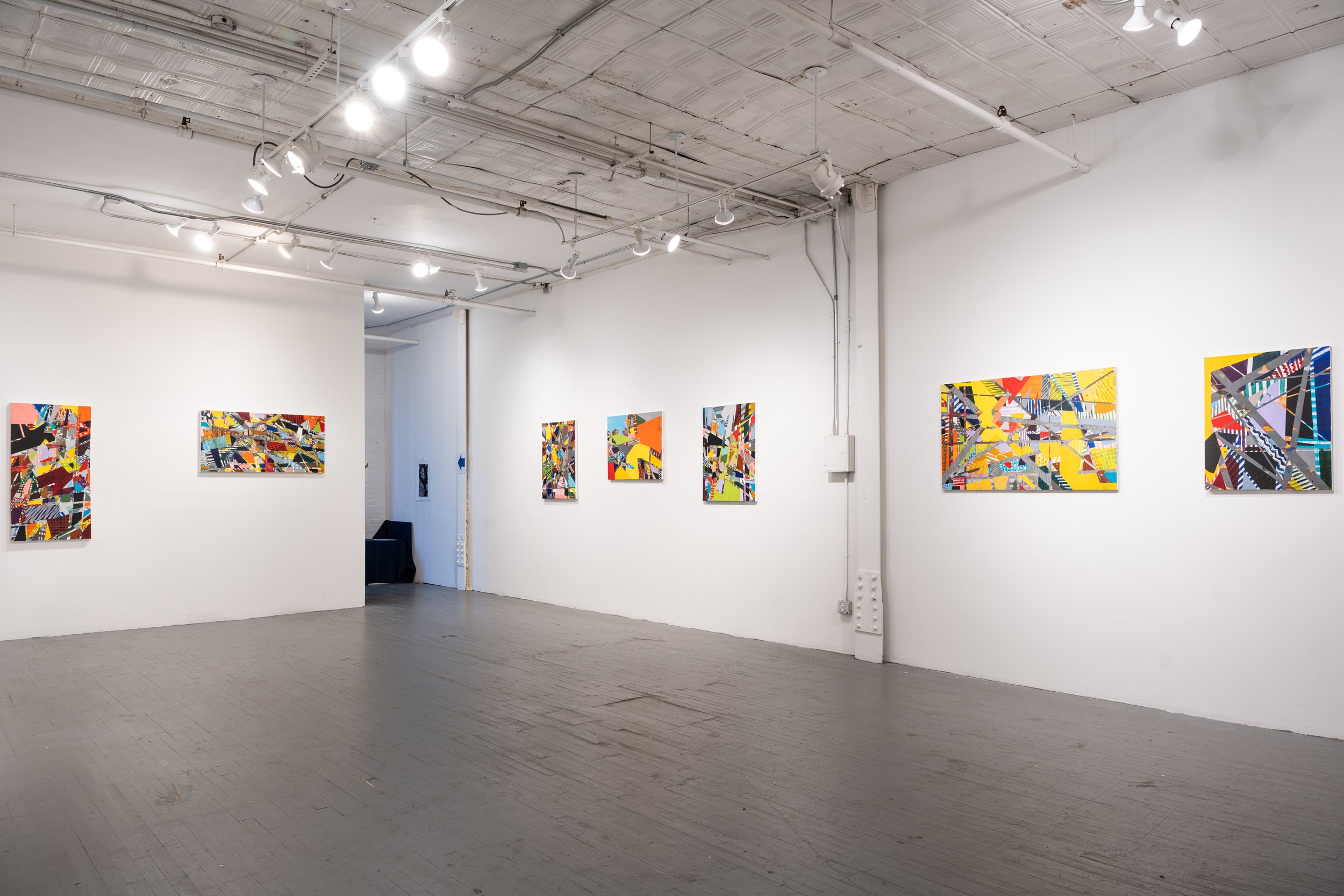
The title of the show comes from the T.S. Eliot poem “The Dry Salvages,” in which Eliot ruminates on those individuals who are undefeated in life because, in the process of continuing to strive, they accumulate a life of “significant soil.”Like the buildup of soil in nature echoed in Eliot’s poetic metaphor, Swan’s work addresses the mental accretion of imagery permeating urban settings that lend a sense of place and meaning which is internally mapped in abstract ways. Most of the work in the show was created during the CoVid-19 pandemic, and reflects the struggle required to create art in this context. The continuing resilience needed to build a life of significant soil in the face of an existential crisis on a global scale lies embedded in the work on display. This show consists of thirteen oil paintings on canvas. The paintings are self-contained, but connected through color and compositional similarity. In the process of creating work, Swan conceives of compositional and aesthetic roadblocks and then improvises his way to a solution while avoiding resolving problems concretely, thus allowing previous stray pathways which eluded resolution to remain visible. The resulting pentimento gives the work its complex composition. Swan has explored geometric abstraction in various mediums over the past two decades, and his recent work is highly architectonic in feel. This series incorporates both the palette and geology of the natural world and the vertical geometries of the urban environment. Significant Soil marks a new trajectory that combines formalist geometric abstraction with a more gestural mark-making than has been seen in previous work. Like other contemporary abstractionists, Swan is in dialogue with the rich history of abstract art in the United States inspired by the interaction of the artist and landscape.

Philip Swan is a self-taught painter who has been showing at Amos Eno since 2018. He has a BA and MSI from the University of Michigan and an MA from the College of William and Mary. He is originally from Michigan and has lived in New York since 1997. His work has been featured in many group shows in Manhattan, Brooklyn, and New Jersey.

Read More

Amos Eno Gallery: "The Longest Distance"

The Longest Distance

Malin Abrahamsson, Irja Bodén, &  Philip Swan

February 6 - March 1, 2020

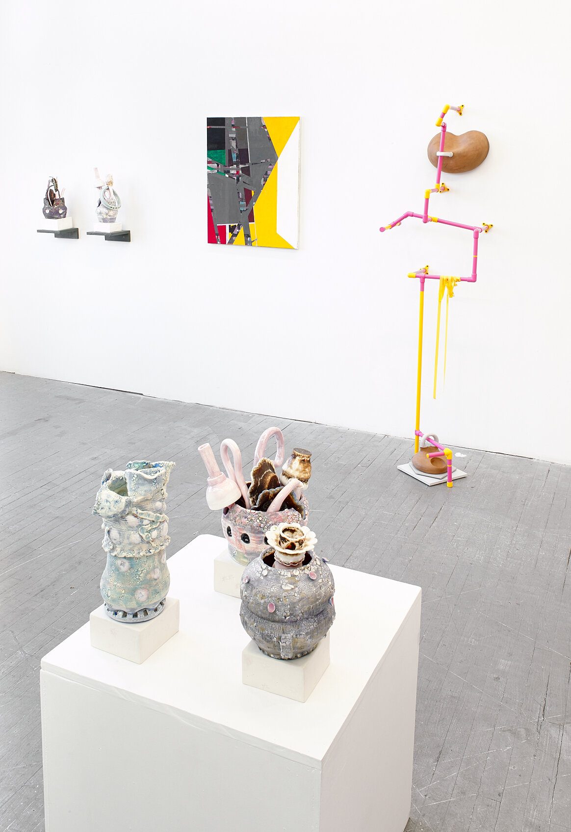
The Longest Distance is the first exhibition to bring together works by Malin Abrahamsson, Irja Bodén, and Philip Swan. The show features ceramics, mixed-media sculptures, and paintings on canvas. The opening reception will be on Thursday, February 6, from 6-8 PM at 56 Bogart Street in Brooklyn, NY.

The title is an oblique reference to the passing of time and its inevitable influence on the process of creativity. A character in Tennessee Williams’ 1944 play The Glass Menagerie states, “I didn't go to the moon, I went much further--for time is the longest distance between places.” Although it is not visible in the works, time is ever-present through an awareness of its scarcity and that there can be no distance traversed without its expense. The pseudo-functional mixed media sculptures, conceptual ceramics, and layered paintings reveal how process is deep-rooted in time.

Abrahamsson and Bodén both use ceramics in their work and are intimately familiar with relinquishing control to time in the processes of drying, firing, and glazing, often repeatedly, before a piece looks right. Time is equally important to Swan who sometimes spends months on an individual painting. Adding layer by layer of paint, each new coat becomes a guide for the next as he works his way to a solution. In this way, time itself becomes a vital conduit: a transmitter of ideas, clues, and consequences.

Bodén, who in the past made functional ceramics, is frequently asked how long it takes to make one cup, mug or bowl. Her response: “something like 25 years.” Today she makes highly textured sculptures that are stacks of skillfully wheel-thrown ceramics that turn the idea of functional ware to precariously balance on its head. Similarly, Swan’s recent works explore the possibilities of masking and layering with increased levels of complexity. Over time, his paintings incorporate more layers and techniques: a slow process of incremental and purposeful painterly considerations that are palpable to the viewer in each work.

Abrahamsson mixes hand-built ceramic objects with synthetic matter, such as latex belts and PVC pipes. Her sculptures visually echo the linear nature of Swan’s painting and the vertical arrangement of Bodén’s stacks. Abrahamsson’s sculptures have shapes that allude to function and which delight in material tension. Choreographed into groups, her objects become stationary conductors that help navigate viewers through multiple meanings of time and space.

-

Irja Bodén works in many media; ceramics are at the core of her work.  Presently on exhibit at the Konstmuseet i Norr, Sweden, Amos Eno will host a solo show of her work in September 2020. Irja grew up north of the Arctic Circle in Sweden, and received her BFA from the State University of New York in 2006.  She is a recipient of several residencies and grants, to include ones from the New York State Council on the Arts and the Vermont Studio Center. Her studio is in New York’s Hudson Valley.


Malin Abrahamsson is an inter-disciplinary artist deeply fascinated by material and existential transformation. The recipient of several residencies, grants, and awards, her work has been exhibited in and around New York and abroad. She has completed a number of public commissions, most recently a Percent for Art commission at PS 377Q in Queens, awarded by NYC Department of Culture and Public Art for Public Schools. Born and raised in northern Sweden, Malin received her BFA with an honorable mention from The School of Visual Arts in 1998. She now lives and works in Brooklyn, NY.


Philip Swan is a self-taught painter who has been showing at Amos Eno since 2018. He has a BA and MSI from the University of Michigan and an MA from the College of William and Mary. He is originally from Michigan and has lived in New York since 1997. His work has been featured in many group shows in Manhattan, Brooklyn, and New Jersey and he has an upcoming solo show at Amos Eno Gallery in October 2020.

Philip Swan2019 EOil on Linen30 x 24 inches2019

Philip Swan

2019 E

Oil on Linen

30 x 24 inches

2019

Philip Swan2019 FOil on Canvas30 x 24 inches2019

Philip Swan

2019 F

Oil on Canvas

30 x 24 inches

2019

2020 AOil on Canvas30 x 24 inches2020

2020 A

Oil on Canvas

30 x 24 inches

2020

Installation view: Philip Swan paintings, Malin Abrahamsson PVC sculptures, Irja Bodén ceramics.

Installation view: Philip Swan paintings, Malin Abrahamsson PVC sculptures, Irja Bodén ceramics.

Installation view: Philip Swan paintings, Malin Abrahamsson PVC sculptures, Irja Bodén ceramics.

Installation view: Philip Swan paintings, Malin Abrahamsson PVC sculptures, Irja Bodén ceramics.

Installation view: Philip Swan paintings, Malin Abrahamsson PVC sculptures, Irja Bodén ceramics.

Installation view: Philip Swan paintings, Malin Abrahamsson PVC sculptures, Irja Bodén ceramics.

Installation view: Philip Swan paintings, Malin Abrahamsson PVC sculptures, Irja Bodén ceramics.

Installation view: Philip Swan paintings, Malin Abrahamsson PVC sculptures, Irja Bodén ceramics.

Rachel Harrison: Life Hack

Introduction “Rachel Harrison Life Hack” is a chronological mid career survey (artist born in New York, 1966) from 1991 to the present. Harrison graduated from Wesleyan in 1989 and moved to Brooklyn in the early 90s, before it became the art hub it …

Introduction


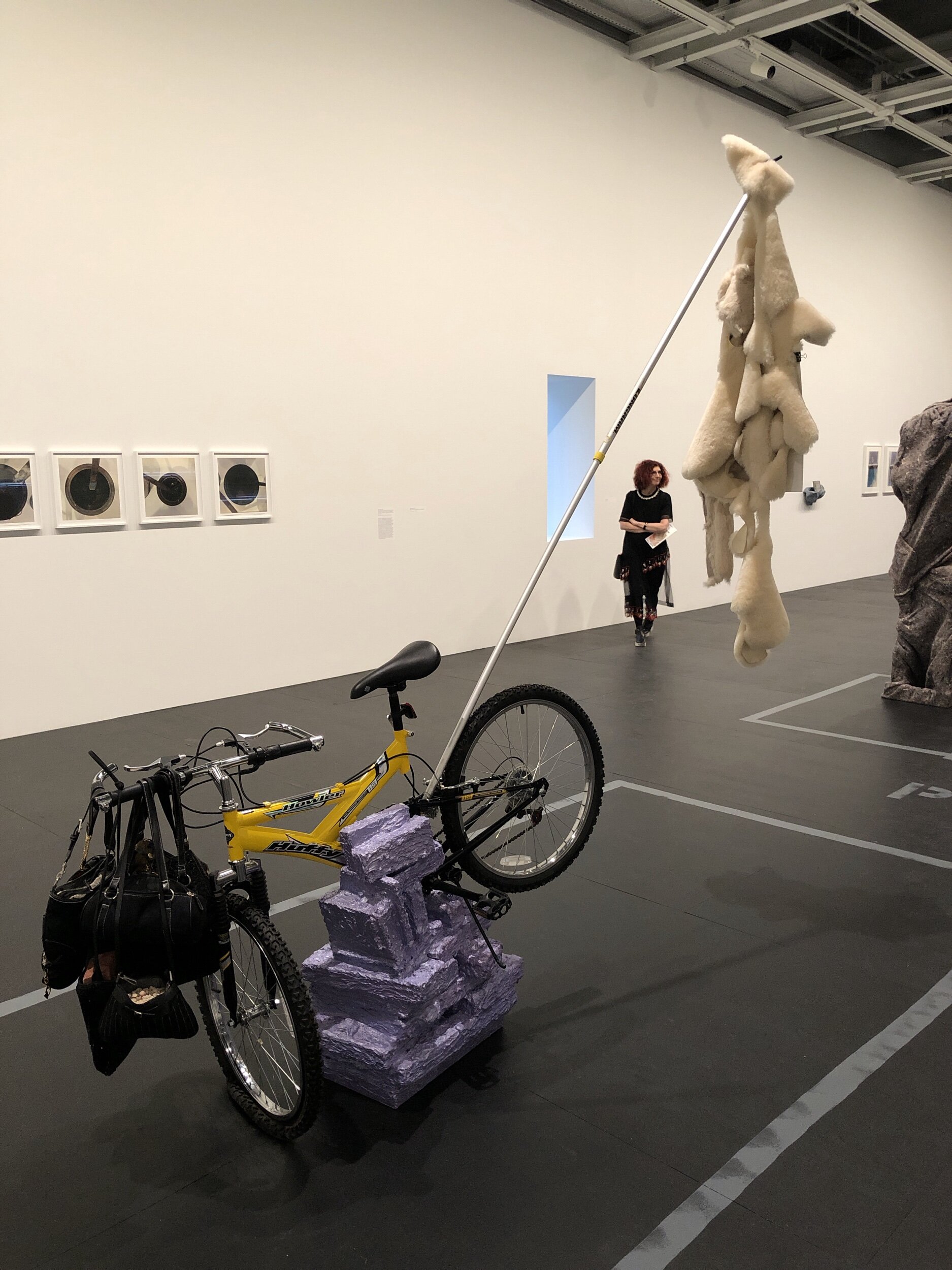
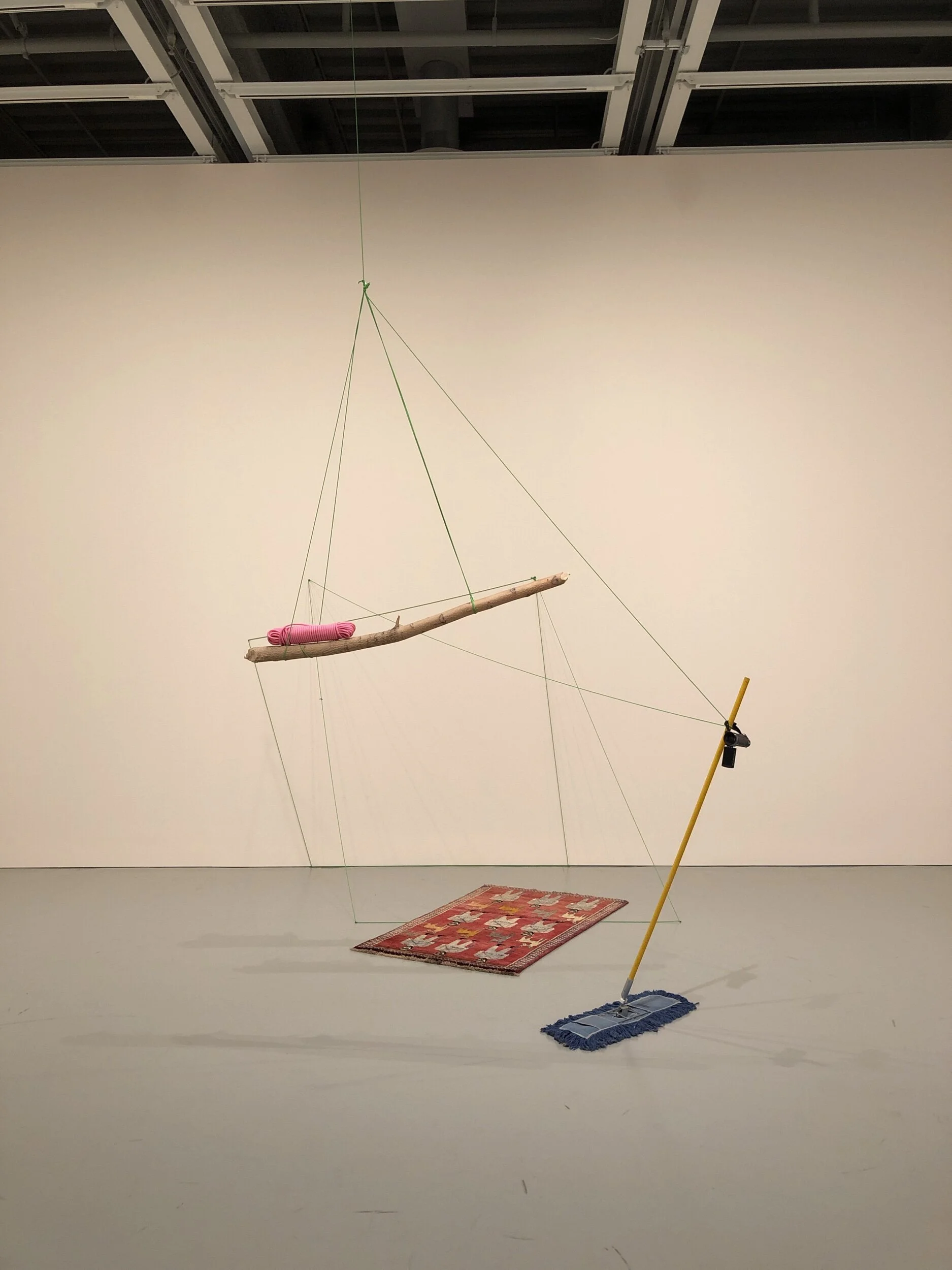
“Rachel Harrison Life Hack” is a chronological mid career survey (artist born in New York, 1966) from 1991 to the present. Harrison graduated from Wesleyan in 1989 and moved to Brooklyn in the early 90s, before it became the art hub it is today. With little money she utilized cheap materials at hand and showed work in alternative spaces and pop up galleries around the city instead of in more traditional galleries. “Life Hack” in this sense refers to her seemingly improvised work, making do with materials immediately at hand rather than materials carefully laid out or gathered beforehand with a plan in mind. These are not the usual materials found in a museum, they seem to be pulled from the aisles of a Home Depot and a Costco, crashing the gates of high culture and presenting themselves as both puzzling and accessible at the same time. Harrison references pop culture as well as art history using everyday, inexpensive materials not normally associated with fine art, with a very “Do It Yourself” aesthetic. The use of such materials undermines the gap between everyday life and art and dismisses the association between art and precious or rare materials. Like Marcel Duchamp and the Dada school a century ago, she also combines a sense of wry humor with her mundane materials, and leaves the meaning of her seemingly absurd works open to interpretation by viewers. There doesn’t seem to be a wrong answer when looking for meaning in her work. For instance, in the murals at the start of the show there is a photograph of a burned bagel called “Are You Sure It’s the Right Baby?” This was a question posed by her mother’s doctor when Rachel was born. There is such a multitude of references in Harrison’s work that it is unlikely that anyone other than Harrison herself can decipher them completely, but the works can still be appreciated without knowing any of these references or even taking the time to learn them.

The first thing to note about this show is the doorway leading into it from the elevator. Rachel Harrison draped some streamers across the door to bar the entrance, an entrance that seems the most convenient as you step off the elevator. The streamers don’t look like an actual barrier, so to make sure no one steps over the streamers the Whitney has put up more traditional stanchions. Harrison is very interested in museums and the way art is displayed in these institutions.

Voyage of the Beagle, 2007This installation consists of 57 photographs and refers to Darwin’s account of his journey on HMS Beagle published in 1839, which lead to his theory of evolution published in On the Origin of Species in 1859. These photogra…

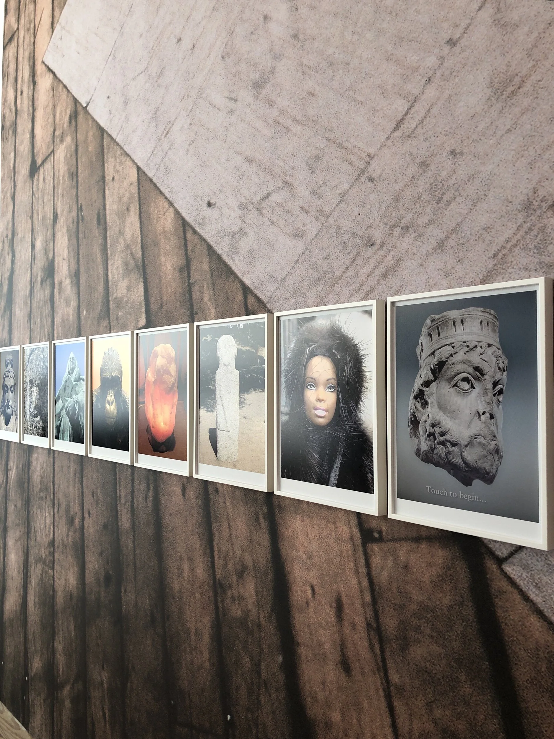
Voyage of the Beagle, 2007

This installation consists of 57 photographs and refers to Darwin’s account of his journey on HMS Beagle published in 1839, which lead to his theory of evolution published in On the Origin of Species in 1859. These photographs record Harrison’s search for the origin of sculpture. She began her voyage in Corsica where she photographed prehistoric menhirs (standing stone) daring from 1500 BC. She continued on around Europe and the United States photographing images of high art and low popular culture and has arranged the photos in a way that shows the relations between the two: another example of the democratization of high art and high culture. She’s also exploring the difficulty of documenting sculpture with photographs: with her own sculpture, she insists on the necessity of walking around it, of seeing it in the round.

Teaching Bo to Count Backwards, 1996-97This gallery contains Harrison’s work from the nineties when she was starting her career. In the Bo Derek piece there are cans of olives stacked on an inverted gutter with photographs of Bo Derek and her husban…

Teaching Bo to Count Backwards, 1996-97

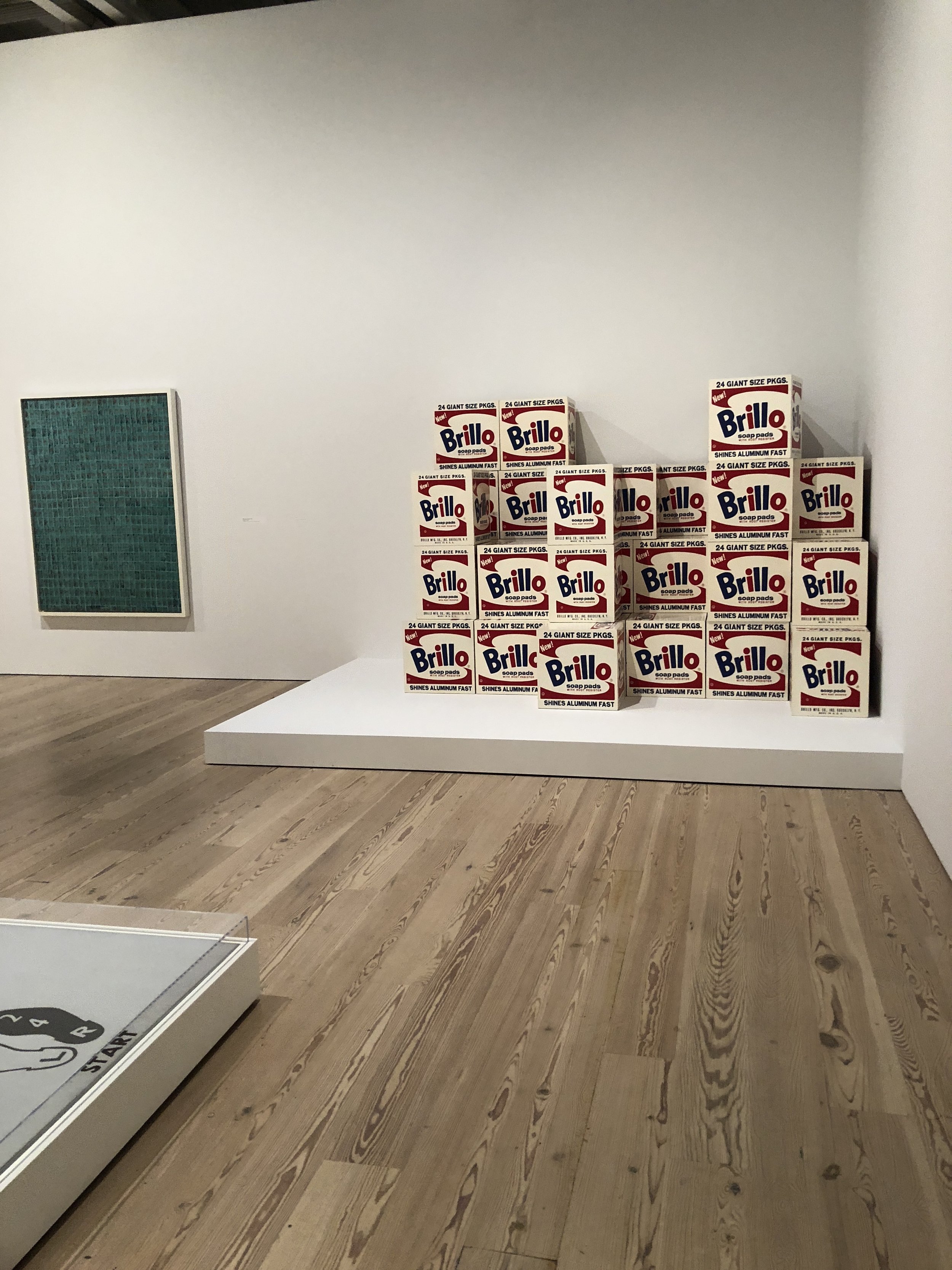
This gallery contains Harrison’s work from the nineties when she was starting her career. In the Bo Derek piece there are cans of olives stacked on an inverted gutter with photographs of Bo Derek and her husband John. As you look at the cans from left to right you will notice that the number of olives depicted on the labels gradually decreases while Bo’s expression transforms at the same time. Her husband John’s expression seems aloof while Bo becomes increasingly assertive. Bo Derek is probably most associated with the movie 10 which was her rating as a beauty and also references the manner of counting via the canned olives in an absurd way. Harrison is usually referencing art history in some way, and in this case we can see a relationship to Warhol’s soup cans as well as the Minimalist focus on systems, especially systems of counting or recording and seriality in repetition.

Untitled (Poles for a Dangerous Art World), 1992There is a piece on the opposite side of the gallery called Dinner which consists of ten Mason jars which comes from her first Manhattan group show in a restaurant in the East Village. Harrison ordered…

Untitled (Poles for a Dangerous Art World), 1992

There is a piece on the opposite side of the gallery called Dinner which consists of ten Mason jars which comes from her first Manhattan group show in a restaurant in the East Village. Harrison ordered dinner from the restaurant and put the leftovers in Ziplock bags which she arranged on the wall in a grid, referencing conceptual and minimalist art in a similar vein as the Bo Derek work. After two days there were so many flies around the bags that the owner of the restaurant complained so Harrison put the bags in Mason jars. Looking at them, you can sense allusions to the bodily functions of ingestion, digestion, and excretion. She further explored this idea of storage and accumulation with Poles for a Dangerous Art World. We are tempted to read the labels on the bags to make sense of the piece, but are warded off by the poles on which they hang: broomstick, paint roller extension pole, pool cue, billy club, ski pole, etc., some of which are sharpened like spears. Obviously, storing art in a Ziplock bag is not something that a museum conservator would recommend, and we get back to this idea of the high and low, art and the reality of the day to day. The bags contain the types of things stowed away in a basement and quickly forgotten: potting compound, hair extensions, denim, bread, tuna can, vacuum lint, foam, tape, wire, etc.

Main Street GalleryThis gallery includes work that Harrison began showing at Greene Nafali from 2004-2007. Looking at her work in the show, you notice that there are no barriers to protect the work, no tape marking off where to stand or stanchions k…

Main Street Gallery

This gallery includes work that Harrison began showing at Greene Nafali from 2004-2007. Looking at her work in the show, you notice that there are no barriers to protect the work, no tape marking off where to stand or stanchions keeping viewers back: the only lines on the floor are in this gallery, which form a map of a town. She wanted to arrange the sculptures in the format of an American town with generic street names like Main Street. As you walk around and look at the works they are like homes and their owners in a small town, odd and sometimes unsettling in a way that undermines the generic sameness of small towns and the people who live in them. Sphinx is a sculpture that you run into as you enter the gallery. You first see a photo of Sister Wendy (a British nun who hosted a BBC art history program in the 1990s) mounted on dry wall, and need to walk around the dry wall to see the sculpture on the other side: appreciating sculpture requires movement. Sister Wendy gave a mass audience access to art history, the ability to appreciate art without the pretentious trappings of the art historical elite. There are photographs on the adjoining wall, titled Perth Amboy, which show an image of the Virgin of Guadeloupe which miraculously appeared in a second story window in a home in Perth Amboy in 2001, attracting pilgrims who waited for hours to see it. Harrison found this touching, and saw it not only as religious devotion but also as devotion to the ideal of the American Dream. While a painting of the Virgin and Child by an artist like Leonardo or Raphael is of great value in the traditional art world, this image of condensation on a window which looks like the Virgin to believers in an immigrant community is of equal or even greater value to them as a direct communication from the Virgin herself. There is a sculpture called Cindy, which features a blond wig and is a reference to Cindy Sherman. Alexander the Great features a mannequin with two faces, with an Abraham Lincoln mask on the back of the mannequin’s head wearing sunglasses. She did a series of works incorporating mannequins she found, along with found materials like FedEx boxes which she coats with a cement like medium. All of these pieces she creates herself, with her own hands, without assistants: real life hacking art.

DB643DB3-BBD5-484E-A41D-95500EBAD1CF.jpeg
Huffy Howler, 2004This work is a mock equestrian statue, the cliche of the heroic man on horseback. There are sheepskins hung from the back of the bike with an image of Mel Gibson from the movie Braveheart and the front of the bike is weighted down …

Huffy Howler, 2004

This work is a mock equestrian statue, the cliche of the heroic man on horseback. There are sheepskins hung from the back of the bike with an image of Mel Gibson from the movie Braveheart and the front of the bike is weighted down with purses full of stones and brick, perhaps a reference to the love conquests of the leading man which actually weigh him down more than they lighten his load. This is the hero of make believe, of a kid daydreaming that they are riding a charging steed as they peddle across their neighborhood, of actors playing medieval warriors while living a pampered life of privilege once the camera stops rolling and they retire to their catered meals and trailers. The hero riding the bike would not get far since the front tire is flat and the bike itself is impaled on a lavender wall-like form. Gibson was once pulled over for a suspected DUI in Malibu, where he berated the police with an anti-Semitic rant and yelled “Don’t you know who I am? I own this town.” This also introduces the idea of ownership, of conquering, even if it is just a sense of privilege and kingship from conquering the world of entertainment.

Sunset Series, 2000Harrison has joked that with this series of photographs she explored travel photography without leaving her studio. She used a found photo of a sunset and challenged herself to create as many photographs as she could using this si…

Sunset Series, 2000

Harrison has joked that with this series of photographs she explored travel photography without leaving her studio. She used a found photo of a sunset and challenged herself to create as many photographs as she could using this single photograph as the template. She rephotographed it 31 times, using different kinds of lenses, different amounts of lighting, changing the aperture of the camera, cropping the photo, bending the photo, taking a photo of the photo from an oblique angle, shining light off of the surface, wrapping the photo in plastic wrap, etc. She did all of this without utilizing a dark room, she simply took 35 mm photos. The subject matter is purposely banal, which was part of the challenge: every photograph of a sunset looks basically the same as every other one even though every one of them seeks to capture a “special moment.” “Let’s capture this magic moment in Cancun forever with a photo of the sun going down over a featureless ocean surface which could be any body of water anywhere in the world.” How can you manipulate it to make it different using low tech techniques and not sophisticated Photoshop like software?

Springs, 2017This series of photographs were taken at the Pollock-Krasner House in Springs, New York. These are photographs of the paint cans that were in Pollock’s studio after his fatal car crash in 1956. The brushes are stuck in cans of hardened …

Springs, 2017

This series of photographs were taken at the Pollock-Krasner House in Springs, New York. These are photographs of the paint cans that were in Pollock’s studio after his fatal car crash in 1956. The brushes are stuck in cans of hardened paint, the fluidity that made his work flow now gone. By shooting them from above, they resemble the holes of a grave.

Hoarders, 2012This piece requires you to see it in the round to appreciate it: sculpture requires movement. What looks like a boulder from one side is seen propped up by a metal bucket on the other, while a video plays on a flat screen where a taxi …

Hoarders, 2012

This piece requires you to see it in the round to appreciate it: sculpture requires movement. What looks like a boulder from one side is seen propped up by a metal bucket on the other, while a video plays on a flat screen where a taxi driver she filmed talks about the way the one percent in this country hoard their wealth. The driver mentions the A&E show “Hoarders,” and compares the hoarders on the show with the hoarding of the wealthy. This echoes the hoarding of food in Mason jars and ziplock bags in the previous gallery, the idea of accretion evident in her sculptures, the gathering of stones and bricks in handbags, etc. The piece looks heavy, but the boulder is made of wood, polystyrene, chicken wire, with cement glue and acrylic: it is hollow and actually quite light.

Drawings of Amy Winehouse, 2011-12Harrison began this series of drawings the year Amy Winehouse died in 2011. There are fifty drawings in all where Winehouse is placed alongside artists who have been long canonized, like Pablo Picasso, Gertrude Stei…

Drawings of Amy Winehouse, 2011-12

Harrison began this series of drawings the year Amy Winehouse died in 2011. There are fifty drawings in all where Winehouse is placed alongside artists who have been long canonized, like Pablo Picasso, Gertrude Stein, Willem de Kooning, Alice Neel and Martin Kippenberg. Is this equating Winehouse’s genius with those of other geniuses, or is it a parody, lumping everyone together in the cult of fame and celebrity, leveling, once again, the idea of high and low art and culture. The drawings depict Winehouse as a caricature, it’s uncertain if they are drawn in sympathy or in mockery. The drawings were done from videos Harrison pulled up online, combing through the endless feed of YouTube. The series also speaks to art school, when the beginning artist learns to draw by looking at images in books and magazines, where things are 2 dimensional and already framed, before commencing with drawings of live models and sculpture. Note that in the drawing featured here the eyes are skewed the same way: Winehouse’s drunken visage is like that of a Picasso.

Installation encircled with chairsThe main feature in this gallery is the platform of sculptures surrounded by a circle of chairs. The idea of an assembly of figures, of monuments in a civic space, a forum, a space for democracy and democratic debat…

Installation encircled with chairs

The main feature in this gallery is the platform of sculptures surrounded by a circle of chairs. The idea of an assembly of figures, of monuments in a civic space, a forum, a space for democracy and democratic debates, as the diverse sculptures each clamor for recognition, to be heard. Of course the irony is that when a visitor sits in one of the chairs, they have their back to the work, to the assembly, the points being expressed. This is if visitors feel free to sit in the chairs, to transgress the “don’t touch” ethic of the art museum. Harrison is actually bothered by benches in museums, which are now just spots for people to look at their phones instead of the art so here if you want to sit and look at your emails you will not be able to look at the art at the same time: you need to make a choice. I’m with Stupid depicts a child mannequin, which is buried in junk, and wearing a death mask. There’s a sculpture on the opposite side with a syringe in it and a sculpture across from I’m with Stupid with a photograph of Santa Claus being arrested, perhaps during SantaCon (which makes it justified in my opinion). It is better to not see each work in isolation, but to see it as a whole, as an assembly, to run your eye over all of it and take it in in its totality. Again, the idea of accumulation, of hoarding: the sculptures could have been spread out through the large gallery room, there is plenty of space, but they are all crammed together on the platform. Harrison is also commenting on museum culture where you see a cone on the floor, a cone that art handlers put on the floor while they are working. The sculpture near the cone is on the floor, not on the platform behind it, as if the handlers had not finished the installation when the show opened.

Full HD, 2019Harrison made a sculpture entitled “Every Sculpture Needs a Trap Door” that incorporated a print out of an Andrea Fraser essay titled “Why Does Fred Sandback’s Work Make Me Cry?” Presumably Harrison included this essay as a reference to…

Full HD, 2019

Harrison made a sculpture entitled “Every Sculpture Needs a Trap Door” that incorporated a print out of an Andrea Fraser essay titled “Why Does Fred Sandback’s Work Make Me Cry?” Presumably Harrison included this essay as a reference to Sandback’s work, which created an illusion of demarcated space using taunt lines of yarn. Full HD seems to reference Sandback in this sense. The minimal nature of this work can be contrasted to the materiality of the works in the previous gallery: it is a stark transition. If you think of the previous gallery as being full of bombast, this is a quiet rejoinder, a self-deprecatingly spare way to close the exhibition.

Perhaps the title is an ironic commentary on the low tech nature of the sculpture, including the old video camera that is presumably not filming in HD. In any event, the camera is pointed at the wall of the gallery so any HD filming will be of a blank wall. The title might also be a reference to the fact that what we see with our own eyes, like this sculpture, is full HD without the use of technology. The phrase “Full HD” suggests that we are about to see something amazing that is worthy of the technology, like a school of fish on a coral reef or a drone flyover of the Grand Canyon or Manhattan. Instead, we get a full HD view of a broom, a rug, a branch, and some cords.The broom echoes the mop at the start of the exhibition: these two mundane cleaning objects bring us full circle. Like other sculptures, there are no caution strips, there is no barrier to getting too close to the work. Given how fragile the work is, leaving it exposed in this way is especially risky.

Andy Warhol: From A to B and Back Again

FullSizeRender.jpg


 -What does A to B and Back Again mean? “If you want to know all about Andy Warhol, just look at the surface of my paintings and films and me, and there I am. There’s nothing behind it.”

 -Warhol challenged the Romantic tradition of the unique hand of the tortured and rarified genius. He made no pretense of being sophisticated, he openly embraced American culture, especially American consumer and entertainment culture. He said the best part of making a lot of money is that he could afford to buy a lot of candy, and he meant it literally, not euphemistically.

IMG_2050.JPG

 Camouflage (1986):

 -Camouflage shows his interest in abstraction: “What can I do that would be abstract but not really abstract?”

 -These works similar to Abstract Expressionists.

 -Very purpose of camouflage is to hide in plain sight. 

 -He felt most comfortable observing and not engaging with others. He felt more comfortable photographing and filming and recording the people who flocked around him in a passive way. He preferred to sleep alone because you had more room to sleep: “So I guess everybody has their own time and place when they turn themselves on. Where do I turn on? I turn on when I turn off and go to bed. That’s my big moment that I’m always waiting for.” Despite being surrounded by people, he wrote that “at the time in my life when I was feeling the most gregarious and looking for bosom friendships, I couldn’t find any takers, so that exactly when I was alone was when I felt the most like not being alone.The moment I decided I’d rather be alone and not have anyone telling me their problems, everybody I’d never even seen before in my life started running after me to tell me things I’d just decided I didn’t think was a good idea to hear about. As soon as I became a loner in my own mind, that’s when I got what you might call a ‘following.’ As soon as you stop wanting something you get it. I’ve found that to be absolutely axiomatic.”. He once wrote that he was afraid he might look in a mirror and see no one there. He said that sex was not as interesting as it was made out to be when you were a kid, and that maybe you shouldn’t learn about sex until you are in your forties so they wouldn’t get bored with the idea from learning about it earlier in life.

-As Warhol described his persona in “From A to B And Back Again”

  • The affectless gaze

  • the bored langour

  • the wasted pallor

  • the chic freakiness

  • the basically passive astonishment

  • the revelatory tropisms

  • the chalky puckish mask

  • the childlike, gum-chewing naïveté

  • the glamour rooted in despair

  • the self admiring carelessness

  • the perfected otherness

  • the wispiness, the shadowy, voyeuristic, vaguely sinister aura

  • the pale, soft-spoken magical presence

 Introduction to Pop Art

 -Warhol said, “Pop art is about liking things.” He once wrote that “three things always look very beautiful to me: my same good pair of old shoes that don’t hurt, my own bedroom, and U.S. Customs on the way back home.”

 -Warhol’s came to prominence in 1962 with a one man show at Ferus Gallery in Los Angeles where he shows his “32 Campbell’s Soup Cans.” He claimed that he ate Campbell’s soup every day for twenty years. It reminded him of his mother and the magic of having a ready meal that always tasted just as good from a can.


IMG_2055.JPG
IMG_2073.JPG

 Green Coca Cola Bottles (1962):


-“What’s great about this country is that America started the tradition where the richest consumers buy essentially the same things as the poorest. You can be watching TV and see Coca-Cola, and you know that the President drinks Coke, Liz Taylor drinks Coke, and just think, you can drink Coke, too. A Coke is a Coke and no amount of money can get you a better Coke than the one the bum on the corner is drinking. All the Cokes are the same and all the Cokes are good. Liz Taylor knows it, the President knows it, the bum knows it, and you know it.” (The Philosophy of Andy Warhol; 1975)

 -One of Warhol’s key concepts as an artist was the “industrialization” of art. Warhol famously quipped, “I want to be a machine,” alluding to his interest in mass production. Warhol wrote: “A friend really hit it when he said, ‘Frigid people really make it.’ Frigid people don’t have the standard emotional problems that hold so many people back and keep them from making it. When I was in my early twenties and had just gotten out of school, I could see that I wasn’t frigid enough to not let problems keep me from working.”

 -He also said "I like boring things. I like things to be exactly the same over and over again." He wrote about how 3/5 of parties aren’t that good, that movie stars are never as interesting or exciting as you thought they’d be when you met them. A Coke never disappoints, a ballpark hotdog never disappoints because they’re always the same.

 -Yet the traditional concept of the masterpiece has relied on originality. Warhol’s works in this gallery challenges the idea that a masterpiece has to be an original image or concept thought up by the artist as well as something that can’t be replicated by others. These works can be approached as concepts as much as aesthetic objects

 -Warhol’s Green Coca Cola Bottles started out with a grid lightly drawn in pencil and then he screen printed the Coke bottle green and overlaid that with images of Coke bottles hand stamped on the canvas. 

 -In commercial art you want evenness of surface and crispness of outline. In Warhol’s hands, the opposite happens; the technique becomes arbitrary and unpredictable, providing visual variety among the repetition. It also gives a sense of motion, almost like images on a film reel.


FA7835A1-2716-42E5-A58F-934EFE9E8CF5.JPG

 Brillo Boxes (1964):

 -He uses silk screening for the Brillo boxes, a technique he would be famous for going forward. “The rubber stamp method I’d been using to repeat images suddenly seemed too homemade,” Warhol said. “I wanted something stronger that gave more of an assembly-line effect.”

-Silkscreen is a print technique where a mesh cloth is stretched over a wooden frame, with a stencil blocking out parts of the mesh. The artist then takes a squeegee and forces ink or paint through the exposed pores of the mesh creating a print that can be repeated endlessly as long as care is taken not to clog the pores.

 -Brillo Boxes were joined at the exhibition with boxes for Del Monte peaches, Heinz ketchup, Campbell’s tomato juice, Kellog’s Cornflakes, and Mott’s apple juice.

 -Warhol had a cabinet maker create wooden boxes in dimensions that corresponded to the cardboard versions and then worked with assistants in his studio to silkscreen the graphics. They were meant to look identical to their cardboard box originals, begging the question of why this should be considered a work of art.

-It’s not so much the aesthetics of the work but the novelty of someone making it in the first place. The idea of making a large number of mundane product boxes for any reason, let alone as art. 

 -The boxes have been compared to Minimalist sculpture at the time. 

 Early Life, 1950s

 -Andy Warhola (he hated his ethnic sounding name and later changed it) was born in 1928 in Pittsburgh, the son of Catholic Czechoslovak immigrants. His father was a construction worker who died when Andy was 13, his mother cleaned houses. Recognizing his son’s talent, his father saved money to pay for Warhol’s college education, and he attended Carnegie Institute of Technology (now Carnegie Mellon University) from 1945 to 1949.

 -Warhol graduated from the Carnegie Institute of Technology, majoring in industrial graphic design in 1949 and moved to New York City to pursue a career as a commercial artist with fellow classmate Philip Pearlstein and created a circle of close-knit friends.


 Early Commercial Work

 -His career immediately took off after arriving in New York. After being in the city for two days he got a job drawing shoes for Glamor magazine. Besides Glamour, he worked for ten years as a commercial illustrator drawing illustrations for Seventeen, Mademoiselle, Columbia records, CBS, Upjohn, Martini & Rossi and the Container Corporation of America. 

-He had a unique sense of how to give personality to products, which would serve him well in his Pop work. 

-Warhol wrote: “I loved working when I worked at commercial art and they told you what to do and how to do it and all you had to do was correct it and they’d say yes or no. The hard thing is when you have to dream up the tasteless things on your own.” He was paid a certain amount for each shoe he drew so he liked knowing how much money he would be getting in such a definite way.

IMG_2054.JPG

 Gold Shoe Drawings (1956):

 -In 1955, Warhol was hired by I.Miller Shoes to create whole page or half page ads on Sundays in the wedding announcement pages of the New York Times.

 -While drawing actual shoe models Warhol started drawing imaginary shoes and slippers using gold leaf and candy-box ornaments symbolizing different celebrities.  

 -Some of the works featured:

 • Elvis Presley – is represented by a buccaneer type of boot with flowery ornamentation to give it foppish quality.

 • Truman Capote – was characterized by a plant-filled slipper made to symbolize his play, House of Flowers.

- Mae West is an old fashioned button up high heel boot with a stocking clad calf. 

 -By 1960 Warhol was making enough money as a commercial artist to buy a four story town house on the Upper East Side but he wanted to break into the fine arts which had a different atmosphere than advertising.

FullSizeRender.jpg

 Transition to Fine Art

-Many in the art crowd saw him as a groupie. Warhol fell for Truman Capote who described him to friends as “a hopeless born loser.” Warhol loved Jasper Johns’ work after the “Flag” painting show at Leo Castelli Gallery but both Johns and Robert Rauschenberg, while gay artists themselves, described Warhol as being too “swish.” 

-”Frigid people really make it…”


IMG_2056.JPG

 Hand painted pop Coca Cola (1962):

-Both images were hand painted using an opaque projector: this is before silk screening.  

-One Coca Cola bottle utilizes expressive brush work, with dripping paint. This is Warhol trying to be a fine artist as he understood it.  

 -Another Coke bottle is crisp, clean, and looks like a straightforward advertisement, drawing on his advertising background.

 -He invited four friends to judge the two paintings and tell him which direction to take. One said that the clean Coke bottle represented “who we are,” that it was “beautiful and naked” and that he should destroy the more artsy image. Galleriest Ivan Karp asked: why is there a drip? AW: because painters are supposed to drip. IK: you don’t have to drip. AW: I don’t want to drip. IK: Then don’t drip.

IMG_2081.JPG


 Celebrities

-As a child Warhol had been fascinated with Hollywood and he wrote to stars asking for signed photos which he kept in scrapbooks. When he was older he bought tabloids and teen magazines to keep up with popular culture. As his fame grew he surrounded himself with celebrities and helped make unknown friends celebrities by promoting their music or using them in his films.

-“In the future, everyone will be world-famous for 15 minutes.” 

-By using silkscreening in 1962, Warhol could use photographs of celebrities without the need to make hand painted portraits like he was doing in with the opaque projector and the Coke bottles. Having multiple identical portraits obviously wouldn’t be possible doing it purely by hand.

-He started with Marilyn Monroe, Elvis Presley, and Elizabeth Taylor, the biggest stars of the time. Their images were mass produced like products, Elvis as Campbell’s Soup. A single photograph makes you think of a person, multiple copies of the photograph make you look at the person as a product, as a thing. 

 Triple Elvis (1963) and Marilyn Diptych (1962)

FullSizeRender.jpg

-Elvis Presley image is from a promotional still from the 1960 Western “Flaming Star.”

-Created in 1963 for a show at the Ferus Gallery in Los Angeles the year after showing the Campbell Soup series at the same gallery.

-He printed all of the images on a single large canvas roll which he sent to LA where the owner of the gallery could cut it up and stretch it as he wished. His only request was that the images be placed right next to each other to echo his repetition patterns with the soup cans, etc.

-The silver background could be a reference to the silver screen: the way he progresses across the canvas is similar to a film reel.

-He also developed a style where a celebrity portrait was first “under painted” by laying down the basic shapes in color and silkscreening the image in black and white over the color blocks.

-Marilyn Monroe died in 1962 of a drug overdose and Warhol spent four months making more than twenty silkscreen portraits of her, all based on a promotional still for the 1953 film “Niagara.”

-Unlike Elvis, Monroe introduces the theme of death as well as celebrity.

-The images on the left are garishly colored, which some have seen as being somewhat misogynist, but can also be read as a commentary of painting her up as a product by Hollywood. The images on the right, fading away in black and white are a study on mortality, using a similar technique he had started with the Coke prints where the print becomes faded or distorted with use.

-Warhol began making films himself when he created his studio which became known as “The Factory” In 1964 which was famously decorated with silver paint and aluminum foil.

-He wrote of this time: “I had by then made my Pop Art statement, so I had a lot of work to do, a lot of canvases to stretch. I worked from ten a.m. to ten p.m., usually, going home to sleep and coming back in the morning, but when I would get there in the morning the same people I’d left there the night before were still there, still going strong…Since I was paying the rent for the studio, i guessed that this somehow was actually my scene, but don’t ask me what it was all about, because I never could figure it out.”

-Warhol made almost 500 four minute silent films he called “Screen Tests,” where the three minutes of film is slowed down and friends at the Factory would generally stay as motionless as the camera, making a “living portrait.” Slowing them down slightly from real time made them dreamlike.

-People like Jack Kerouac, Allen Ginsberg, Peter Fonda, Dennis Hopper, Judy Garland, the Rolling Stones, and the Velvet Underground. Warhol was most interested in Edie Sedgwick, whose sense of style, looks, and reckless lifestyle he found horrifying and fascinating.

IMG_2094.JPG

Ethel Scull 36 Times (1963): 

-This portrait is an example of the fifteen minutes of fame aspect of Warhol’s work. Anticipates the current idea of the selfie posted on social media. 

-Comissioned by Ethel Scull’s husband, a New York City taxi tycoon who has been accused of being the first person to collect contemporary art as an investment rather than from a disinterested love of art. Robert and Ethel Scull had bought several Warhols before this commission.

-Ethel was surprised when Warhol took her to a photo booth in Times Square, rather than having the photographs done professionally. Feeding quarters into the machine, Warhol directed her how to act as the automated camera took photos. 

-Unlike Elvis and Marilyn, there is not a repetition of a single image, although there are repetitions here and there that are reversed or cropped or printed on a different color in a way to make it less obvious. There are 17 different poses from more than the 100 total taken among the 36 images in the work. It almost has the effect of a flip-book where she seems to come alive in front of us.

-Ethel can act and pose like a star in the privacy of the booth without feeling self conscious. She is peforming in a sense, being flirty and outrageous in a way that seems to have a larger audience in mind. 

 -After the couple divorced she donated the painting to the Whitney and he donated it to the Met so the two museums have a shared custody agreement where it divides its time between the two museums every five years.


 Death and Disaster Series:

 -A curator friend of Warhol’s said “enough with life, you should focus on death for a while.”  As Warhol listened to radio reports of death and destruction and saw tabloids with gruesome headlines he formulated an idea.

-In 1964 Warhol had his first European solo show in Paris with works that would later be called the “Death and Disaster” series. When he was asked his thoughts on death Warhol said “I believe in it.”

- “When you see a gruesome picture over and over again, it really doesn’t have any effect.” ANDY WARHOL, ARTNEWS, 1963

FullSizeRender.jpg

 Mustard Race Riot (1963):

-Mustard Race Riot is based on Charles Moore’s Life Magazine photographs of civil rights demonstrators being attacked by police and police dogs in Birmingham Alabama in 1963. Moore was a Baptist preacher and native of Alabama who wanted to document what was happening in his state for the larger world to see. This particular photo is of a police dog tearing off the pant leg of a demonstrator.

-These series of photos played a large role in convincing members of Congress to pass the Civil Rights Act of 1964 the next year.

-In works like this you sense more of a poltical awareness, a move away from pop culture toward a commentary on the ills of American society. Warhol, in short, takes off his mask and reveals someone who is fully aware of injustice and is troubled by it. The mustard color suggests sulfur or something else noxious.

-At the same time, Warhol was still an entrepreneur and offered collectors an additional blank panel of the same color for an additional cost, giving it the scale of an Ellsworth Kelly or a Barnett Newman.


Lavender Disaster (1963):

Lavender Disaster (1963):

 -This work is based on a 1953 photo of the electric chair used to execute Julius and Ethel Rosenberg at Sing Sing prison in Ossining New York.
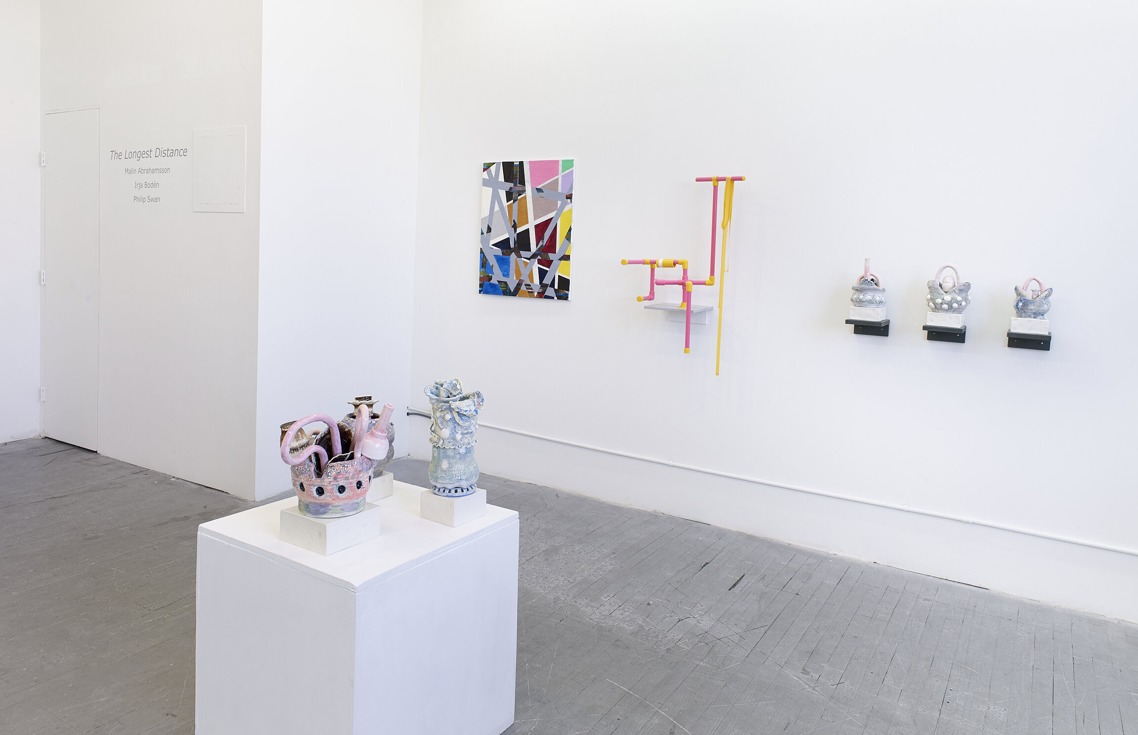
-New York state executed its last prisoner at Sing Sing using the chair in 1963, the year Warhol made the work. Like the civil rights unrest in Birmingham, Warhol is hitting on the social issues of 1963: the year seemed grim, but this was before Kennedy was shot that fall.

-Warhol said “the more you look at the same thing, the more the meaning goes away and the better and emptier you feel”.

-Unlike the noxious mustard, the beautiful lavender color and its suggestions of spring mark an odd contrast with the grim subject matter.

-When asked if there was social criticism in this work he denied it, saying simply “No meaning, no meaning”. Given that he returned to this image over the following decade, the image undoubtedly meant more to him than he was willing to admit.

-He may have been protesting the death penalty, or he may well have simply been pondering death in the spirit of a momento mori, a topic that came to consume him more and more as he got older. The chair is in an empty chamber, it sits waiting for an occupant and we can’t help but imagine if it was us. In one form or another, we all have a chair or a bed waiting for us. 

Warhol is shot and embraces Business Art: 

-Warhol lost the lease on his Silver Factory in 1967 when he found out the building was going to be torn down and relocated to another building on Union Square West, close to Max’s Kansas City where artists had long hung out.

-On June 3, 1968, Valerie Solanas, a woman who had appeared in one of Warhol’s films and founded S.C.U.M." or "Society for Cutting Up Men" walked into his studio and shot him repeatedly with a .32 Beretta, puncturing his lungs, stomach, liver and spleen. When he arrived at the hospital doctors briefly pronounced him dead. The surgery to save him left scars across his torso that made him extremely self conscious and he had to wear a corset the rest of his life. He said he was afraid to look at his scars, he avoided taking off his clothes.

-Warhol wrote: “Before I was shot, I always thought that I was more half-there than all-there-I always suspected that I was watching TV instead of living life… Right when I was being shot and ever since, I knew that I was watching television. The channels switch, but it’s all television.”

-Warhol’s practice changed: a security guard was stationed at the entrance of the Factory and he became more guarded in terms of collaboration. He avoided disturbed women and surrounded himself with drag queens like Candy Darling instead, who reminded him of classic Hollywood stars he’d loved since he was a kid. Warhol said “I stopped being creative when I was shot.” He let his assistants create work under his name while he turned away from the indie scene and delved wholeheartedly into the glamorous world of the rich and famous, creating commissioned portraits for high society patrons for $25,000 each (which are in the lobby). He was finally inside instead of looking in from the outside.

-  Warhol wrote in THE Philosophy of Andy Warhol (From A to B and Back Again), “Being good in business is the most fascinating kind of art. Making money is art and working is art and good business is the best art.”  Business Art was “the step that comes after art.”

-Many critics saw him as a has been, as a sell out. He did portraits of Nancy Reagan, the Shah of Iran, Imelda Marcos, and tried to do one of Donald Trump, a far cry from the crowd at the Factory. He was very close to the Reagans which was not popular in the art world of the 1980s: he put Nancy Reagan on the cover of Interview Magazine in 1981 after the Reagans came to the White House. He did not judge people, whether they were in the counterculture or the right. He was drawn to power and fame and the pomp and circumstance that went with that. At the same time, he was now making enough income to experiment with other mediums like Interview Magazine, television, films, music, etc. that would not have been possible before.


1970s

1970s

-In the 1970s he wanted his life to be quieter. He was more famous than ever but a lot of people weren’t sure what he was famous for. His films shown in this gallery are similar to diaries: he is constantly recording his life and the people around him, anticipating social media. One of the videos on the left shows him making the large Mao painting with a silkscreen. Warhol designed the cover for The Rolling Stones’s album Sticky Fingers in 1971, and the design was nominated for a Grammy Award. He was a regular at Studio 54, carousing with the likes of Halston, Liza Minnelli, and Bianca Jagger.


Mao (1972):

Mao (1972):

-Warhol had retired from painting in 1966 (cow wallpaper) but returned to it in the 1970s. In the same vein as the curator suggesting he focus on more serious topics like death in 1962, Warhol’s dealer ten years later suggested he paint the most famous person in the world: again, the biggest, most famous, fascinated Warhol. The dealer suggested Einstein but Warhol picked Chairman Mao instead, who was in the news at the time after Nixon’s visit. Warhol read an article in Life magazine this image of Mao was the most reproduced in the world since it appeared in every copy of the Little Red Book. Again, like picking mugshots of men which he presumably knew would be problematic, Warhol picks the leader of Communist China rather than a less controversial celebrity like Einstein or Mother Theresa presumably, in part, because it would get noticed.

-Warhol created four images of Mao, each 15 feet tall that were first show in Paris in 1974 set against the Mao wallpaper shown on the opposite wall. The vitrines show his working process and there is a video of him making the silkscreens. 

-Warhol laid the large canvas on the floor and covered it with paint and then silkscreened the image over it, the same way he did it with Marilyn Monroe. Like Monroe, Mao’s face is covered in garish makeup, including eye shadow and rouged cheeks. Even the drab tunic is brightened by expressionist brush work in a variety of colors. 

 1980s

-In the eighties Warhol began collaborating with young artists like Keith Haring, Jean-Michel Basquiat and Francesco Clemente, saying that the eighties felt like the sixties again: the early eighties had the feel of the sixties in terms of the synergy between art and music. When collaborating with Basquiat each artist would work independently on the work and pass it back and forth to have it altered in turn by the other artist. In these works Warhol returned to painting by hand instead of using silkscreens, something he hadn’t done since the early sixties on works like the Coke bottles. Basquiat said “Andy is such a fantastic painter! His hand painting is as good as it was in his early years. I am going to try and convince him to start painting by hand again”

-Warhol also became more involved in television, producing Andy Warhol’s T.V. (1980–83) and Andy Warhol’s Fifteen Minutes (1985–87) for MTV. He also appeared on shows like The Love Boat and Saturday Night Live, was involved with the new field of music videos, and began making digital art.


Paramount and Third Eye (1984-1985):

Paramount and Third Eye (1984-1985):

-Paramount and Third Eye are examples of collaboration with Jean-Michel Basquiat. In the Warhol spirit, Basquiat interrupted Warhol at lunch and sold him one of his postcards for $1.00. Later, Basquiat’s dealer took him to the Factory where they took polaroids of each other and Basquiat sent Warhol a newly finished painting the same afternoon. Impressed by how fast Basquiat painted, Warhol became his mentor.

-The collaboration paintings began in 1984. Warhol would start the process by laying down something recognizable like a logo and then Basquiat would deface it and send it back for a response. Basquiat would purposely leave space for Warhol to add to since Warhol usually wanted to just do one thing and be done with it. This would go on for two or three rounds until there was a balance between the two. 

-The Paramount Pictures logo might refer to Warhol’s partner at the time Jon Gould, who was Vice President of the company.   

IMG_2162.JPG

Self-Portrait 1986 

-Thoughtout his life Warhol was self conscious about his looks. He dyed his hair gray when he was in his twenties so that “everyone would be impressed by how young I looked” and “I would be relieved of the responsibility of acting young.” Later, he wore wigs to cover baldness. Most of all, he couldn’t bear the sight of the scars from his shooting. He had to wear a girdle the rest of his life to support the damaged stomach muscles. He spoke of his “albino-chalk skin,” “the roadmap of scars,” “the long bony arms, so white they look bleached,” “the pinhead eyes,” “the graying lips,” “the banana ears,” “the cords of the neck standing out around the big Adam’s apple.” “Nudity is a threat to my existence.” His nose always bothered him, even people in his family called him “Andy the Red-Nosed Warhol” so he had his nose sanded and got a nose job. He lost all of his pigment when he was eight and was called spot.

-In reference to his being shot, Warhol said “When you hurt another person, you never know how much it pains. Since I was shot, everything is such a dream to me. I don’t know what anything is about. Like, I don’t know whether I’m alive or whether I died. I wasn’t afraid before. And having been dead once, I shouldn’t feel fear. But I am afraid. I don’t understand why.”

 -It’s notable that he created no works directly addressing the HIV/AIDS epidemic. Warhol’s friends began dying of the disease, including his partner Jon Gould in 1986. Warhol, like others at the time, were terrified of getting the disease from casual contact, he worried about getting AIDS from hugging someone or drinking out of the same cup. This fear drove a renewed devotion to his Catholic faith, including meeting Pope John Paul II in 1980.

-Part of that fear can be seen in his gaunt face in the large self portraits wearing the wig. Skull prints with baby face shadow. Death is a presence among the frivolity.

Camouflage Last Supper (1986):

Camouflage Last Supper (1986):

-In 1984 Warhol was commissioned to create a series of works to be installed across from the convent in Milan where Leonardo da Vinci’s “Last Supper” is painted. Warhol created around one hundred Last Supper works.  Works such as this have been interpreted as a meditation on faith in the context of the AIDS crisis while also working on a portrait of one of the most famous people in all of history done by one of the most famous artists in all of history.

-At the same time, this interpretation could be colored by the fact that he died in 1987. While working on the Last Supper series he was negotiating with Arnold Schwarzenegger for a portrait of his wife Maria Shriver, creating curtains for the New York City Ballet and was extremely enthused about going to the 75th birthday of the Oreo cookie, hoping that he would get a commission after biting into a cookie and saying “Miss Oreo needs her portrait done.”

-While in Milan for the Last Supper opening he felt twinges of pain from his gallbladder: there was a family history of gallbladder issues, his father had had his gallbladder removed. He wrote in his diary that he hoped it was just the flu. After returning to New York he went to New York Hospital for gallbladder surgery. When he arrived at the hospital he asked “Are there any stars here” and was told that no, he was the biggest. When he got to his hospital room he immediately turned on the TV and watched “Divorce Court” with a Kitty Kelly biography on the nightstand. He was terrified of being operated on and had put off the surgery to the point that when the doctors removed his gall bladder it fell apart from gangrene. He seemed fine after the surgery and made calls to friends but when the nurse checked on him that evening he was unresponsive: his heart had stopped in his sleep. He was buried next to his mother and father in a Byzantine Catholic Cemetery in Pittsburgh.


IMG_2080.JPG

 Conclusion:

-Warhol and Trump met in the 80s. Trump liked Warhol’s phrase “Business Art” and adapted it for his book title “The Art of the Deal.” In 1981 Trump commissioned Warhol to make a series of portrait of Trump Tower. Warhol created the works but Trump did not end up buying them. Despite this, Warhol would probably be attracted to Trump today because he is a star, he is the biggest star, and making a giant portrait of him would be equivalent to the controversy of the Mao portrait or the hammer and sickles or the 13 most wanted men. 

-His legacy lives on in the world of selfies and social media, the recording of even the most mundane aspects of day to day life, the ability to be famous for fifteen minutes based on YouTube videos or Instagram memes (think of the Kardashians). In Andy’s world, art comes down from the mountain, it’s a celebration of everyday joys, and it opens up fame and fortune to those without any discernible talent. We can all be stars in the film that is our life. 

-With all that being said, his painting of Mona Lisa is a haunting suggestions of where his work might have gone if he hadn’t died at 59. Perhaps his exploration of faith and contemplation of mortality might have taken him into profound new directions. Instead, we are left with an endlessly repeated image of the Mona Lisa, a woman perhaps more famous than Marilyn Monroe, fading into a mist of nothingness.